A new product for Aftenposten’s 450.000 readers The best of feature and culture
Strategy | Concept | Content | Editorial design | Art direction
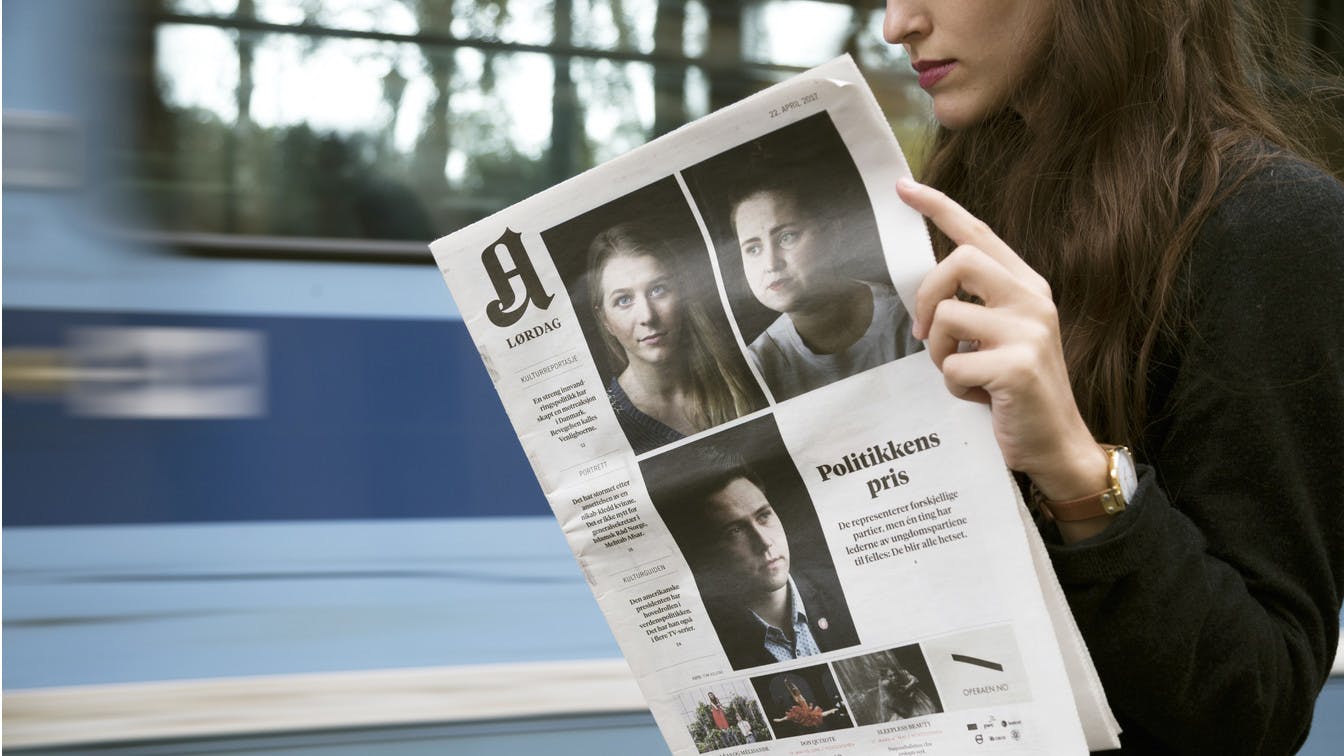
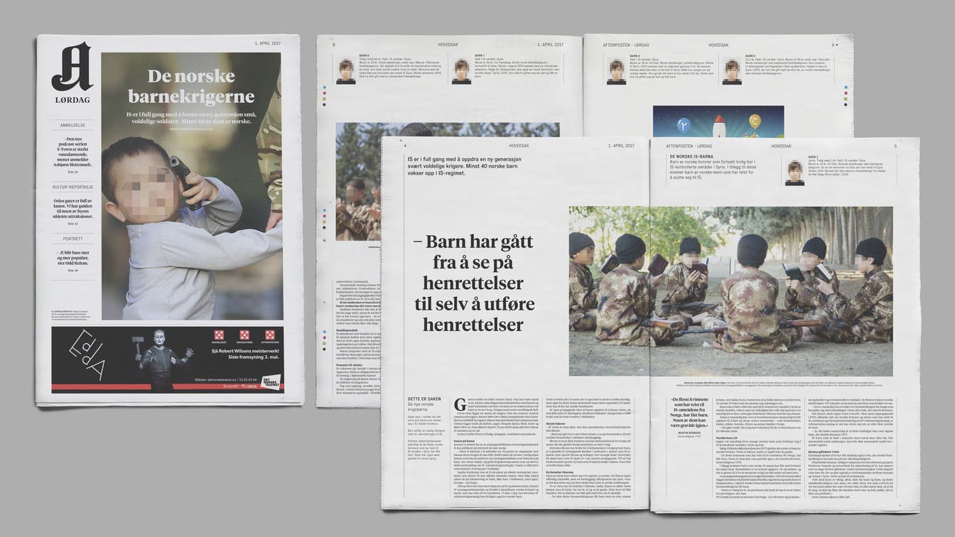
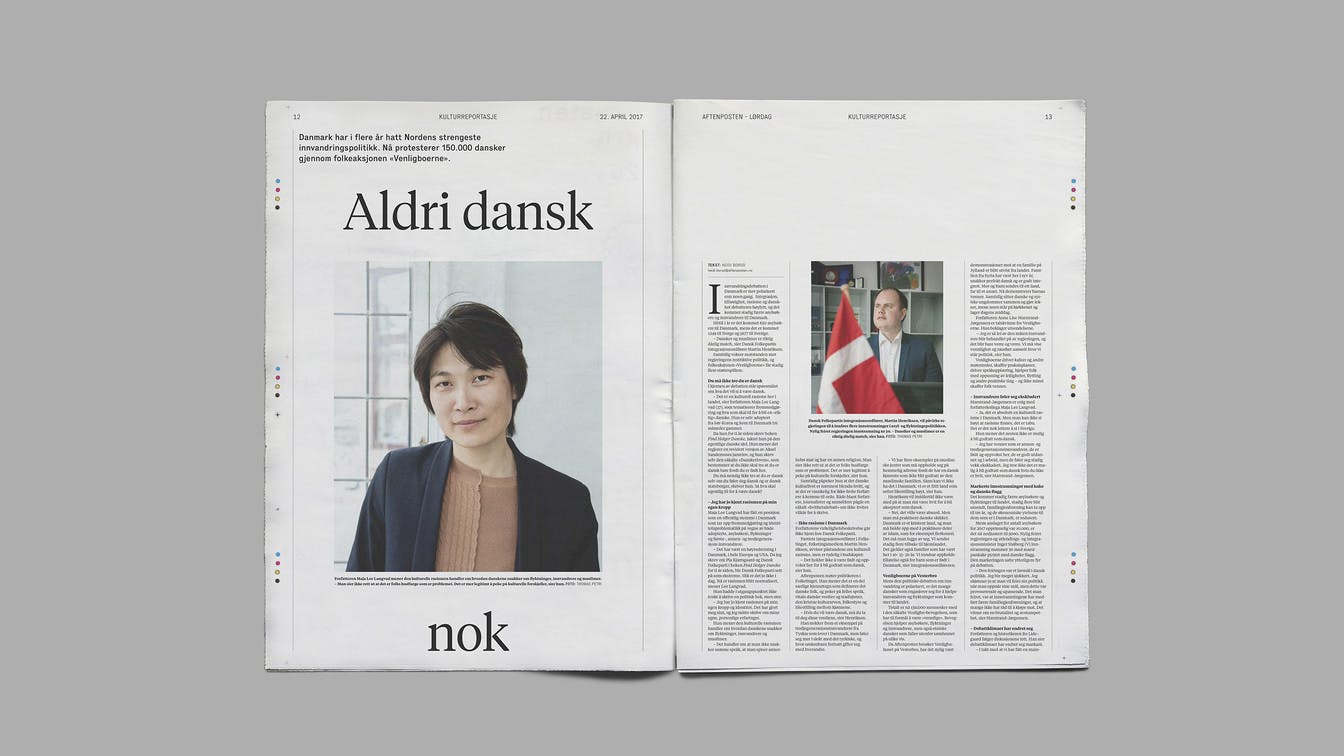
In April 2017, Aftenposten launched a new supplement for its Saturday newspaper, with in-depth features, cultural content and news documentaries. The new product, Aftenposten Lørdag, would give the newspaper’s 450,000 readers more content to delve into during the weekend, as well as create a new and attractive advertising platform.
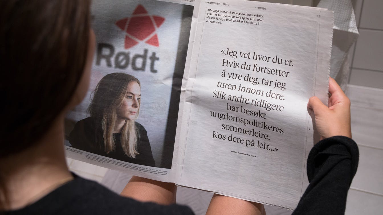
Photo: Tor G. Stenersen
Working with the visual identity and the editorial design for Aftenposten Lørdag, the aim was to enhance the unique characteristics of the new supplement, as well as maintaining aspects of the overall identity of Aftenposten.

Visual journalism
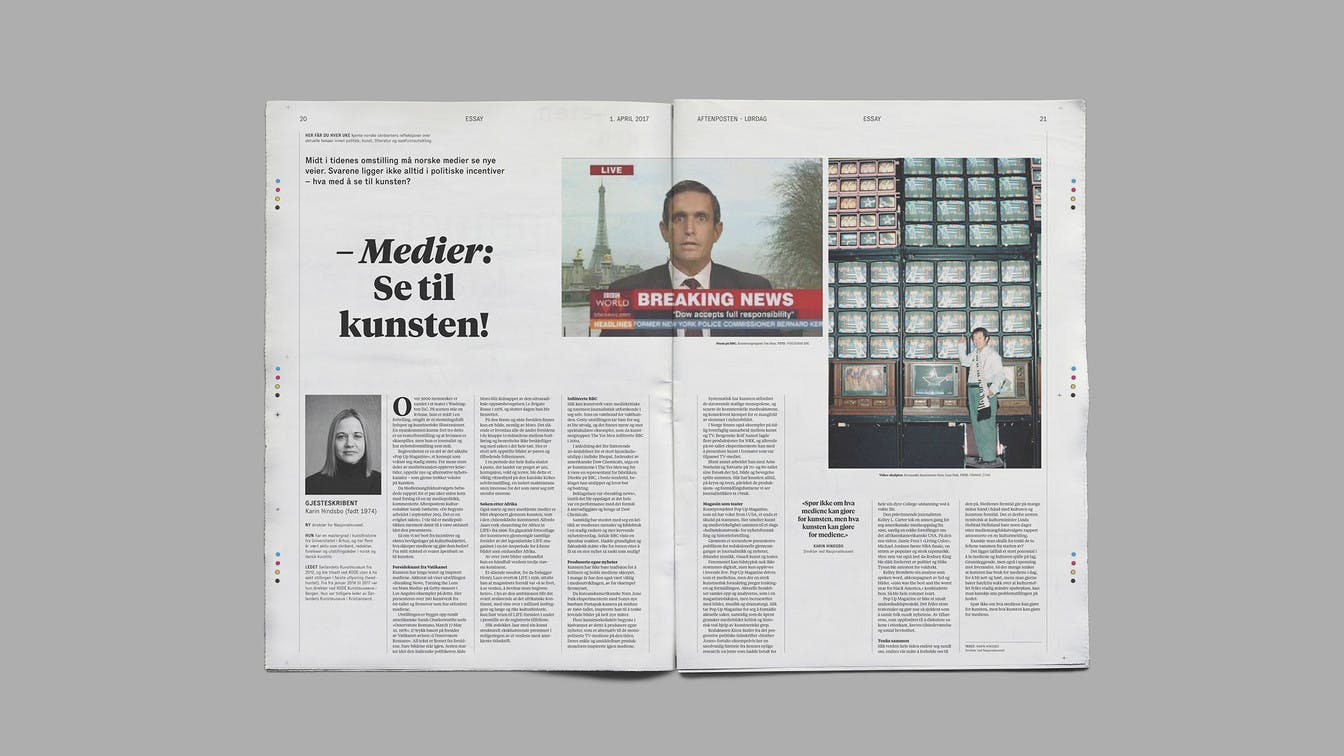
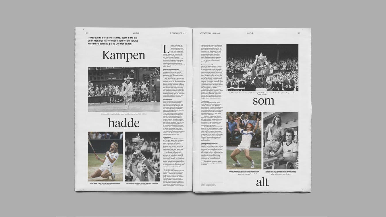
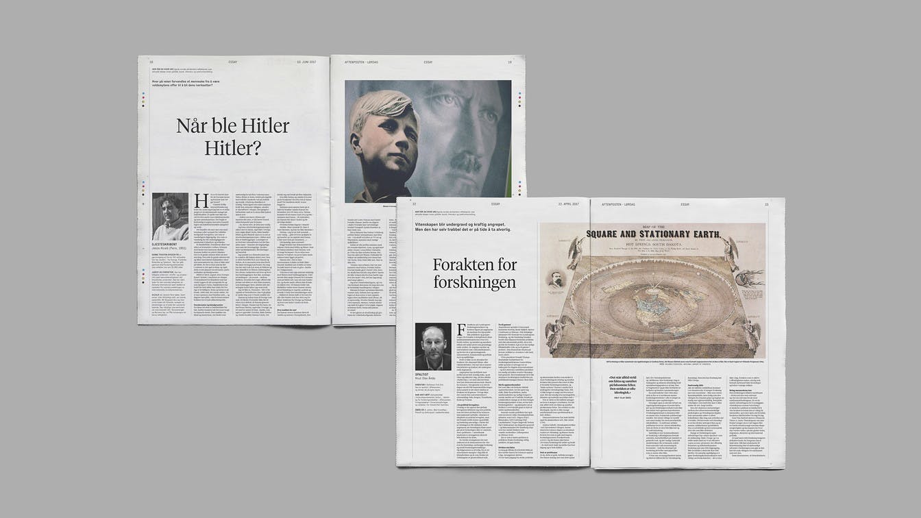
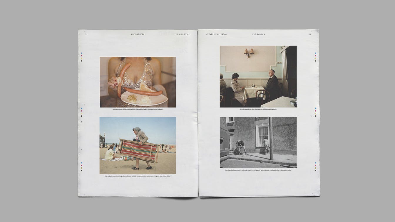
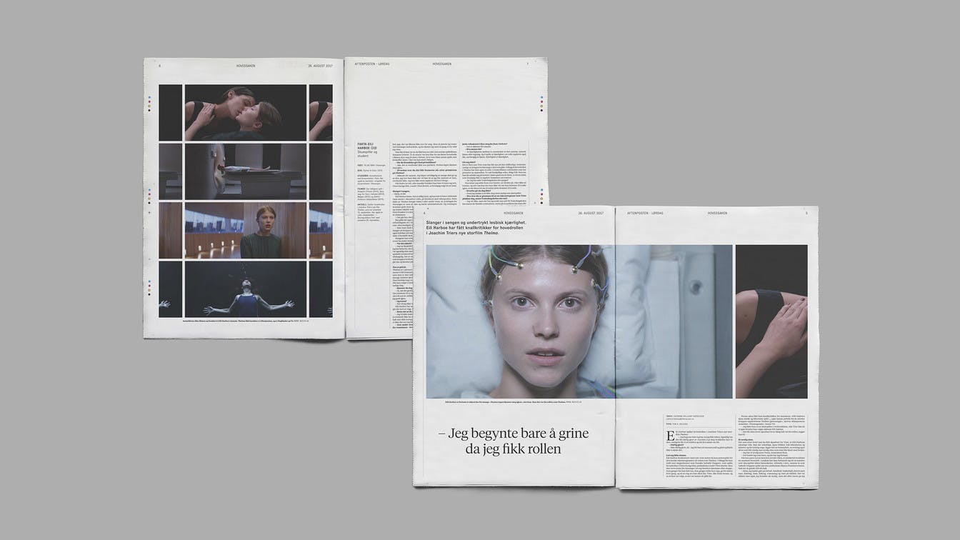
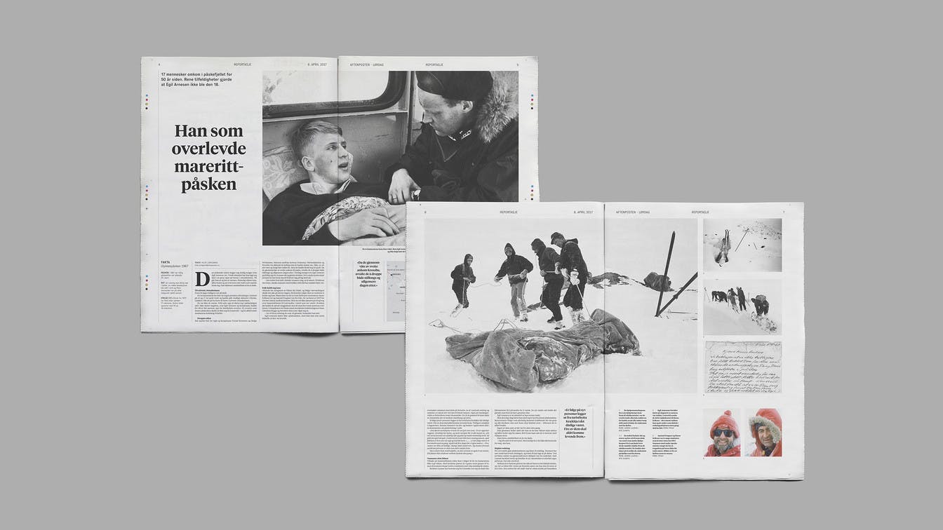
As the news constantly change, the content of Aftenposten Lørdag would often not be concluded until minutes before the newspaper was sent off to print. Despite this, the ambition was to give visual journalism a bigger priority in terms of the editorial design and the layout principles, and as communication through photography, illustration and infographics.
Merket for god design, DogAThe product scores high on form and function, is perceived as innovative, and is at the forefront of its field, also internationally. The craft is precise and solid, and we especially wish to emphasise how they have adapted the layout to long reads, and how they use illustration and photo to keep the readers’ attention.


Saving time through new design principles
Freeing time and resources within the newspaper to focus on visual journalism meant having to save time during other phases of the production. The new design and the new templates had to be strictly based on rules in its main principles to create room and time for creative and customised solutions where needed.
Merket for god design, DogAThe publication is well-structured and appealing. It follows the newspaper's demand for an efficient workflow, but at the same time provides room for different treatments of the content. Simply put, a solid piece of work.
First edition in print: In April 2017, the first edition of Aftenposten Lørdag was sent to print.
Identity through typography and layout principles
In terms of production, we used the same page format, paper quality and modules for advertisers. This meant that the uniqueness of the identity largely needed to be based on typographic principles and layout structures.
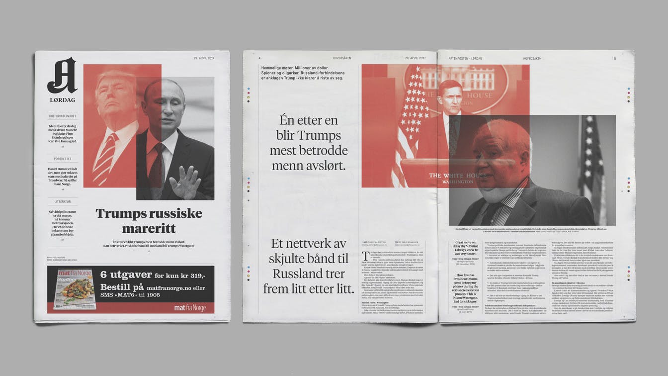
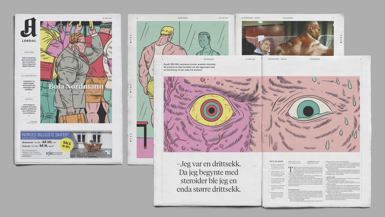
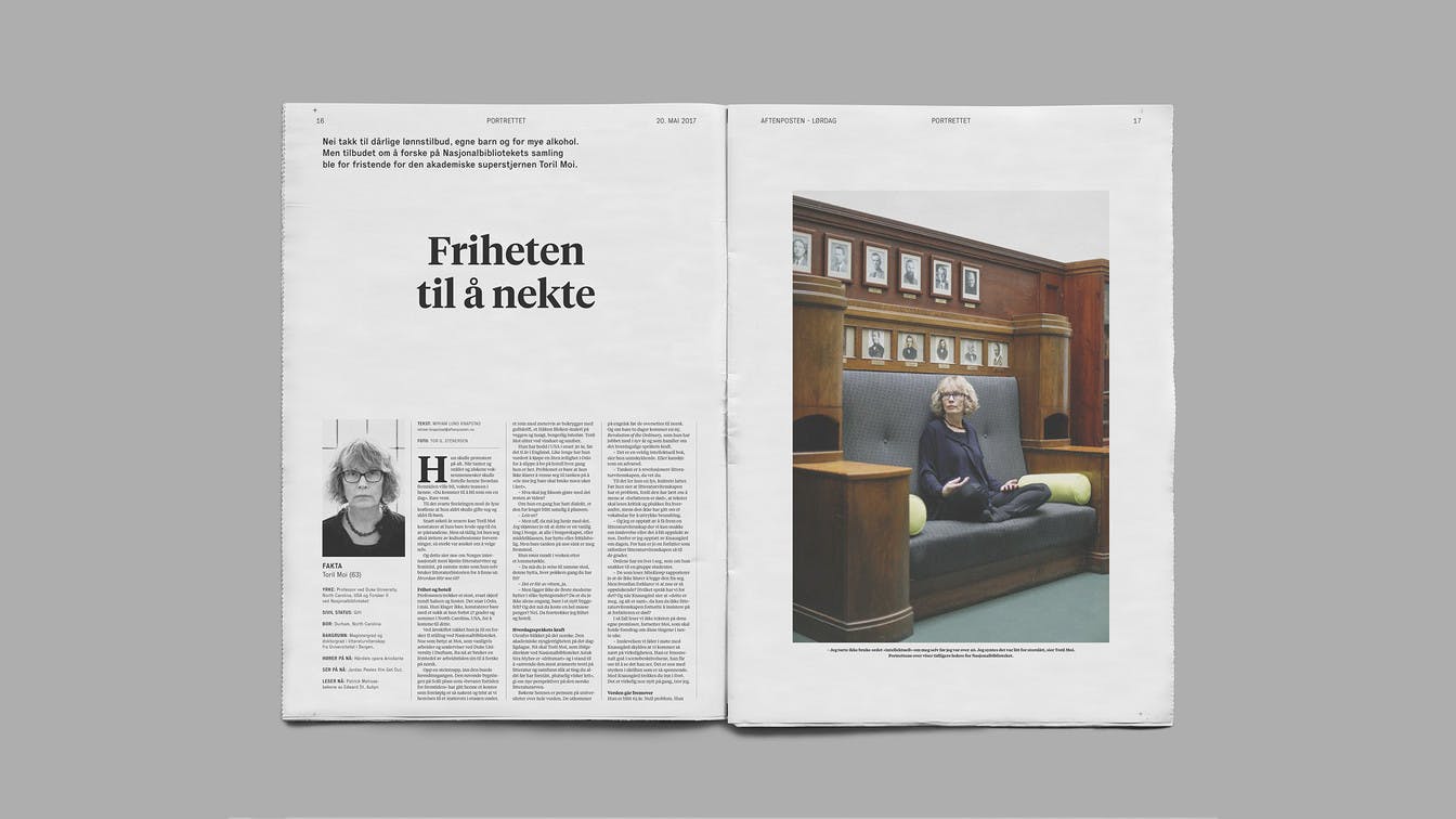
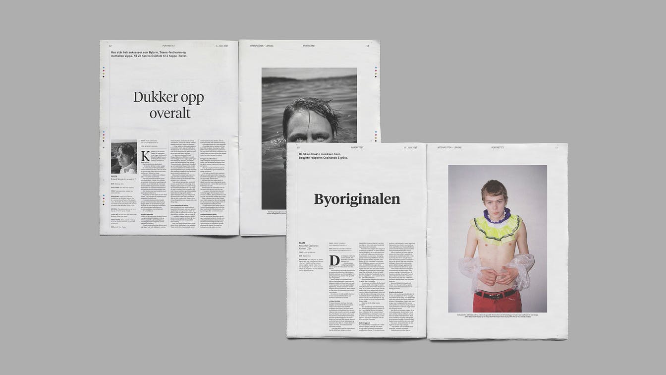
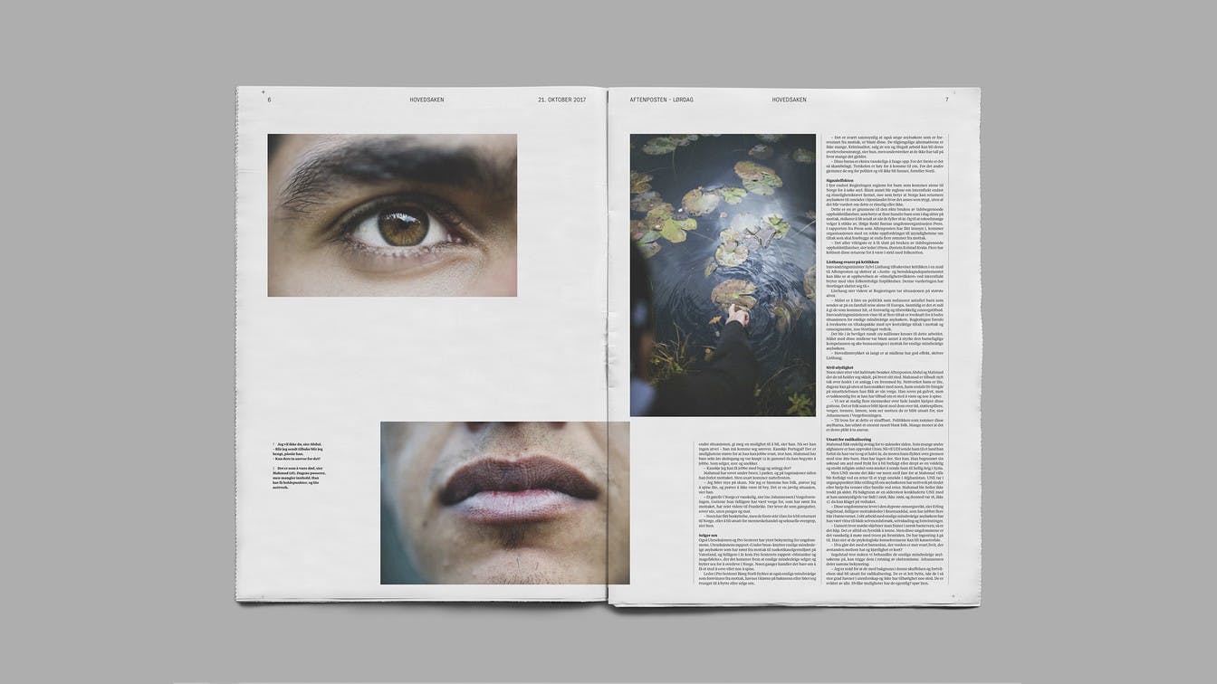
To enhance the idea of this being a hybrid between a magazine and a newspaper, containing long-reads regarding current affairs, we chose to introduce wider columns compared to what you traditionally experience in Norwegian newspapers.
This created a comfortable reading experience for the longer stories, with roughly 60 letters per line. It also made a clear distinction between the more elaborate stories and the shorter texts, with 5, 4 or 3 columns per page, depending of the nature of the content.
The layout is to a large extent based on standard photographic proportions (4:3), avoiding unbeneficial cropping of already well-composed photographs.
VisueltkonkurransenThe newspaper is well structured and inviting. It follows the newspaper's rules for effective workflow, but at the same time provides room for different treatment of the substance. Simply a solid piece of work.
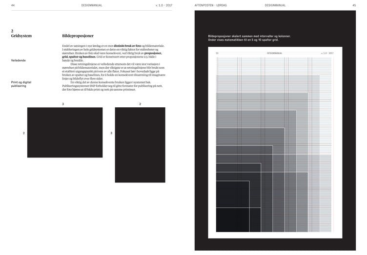
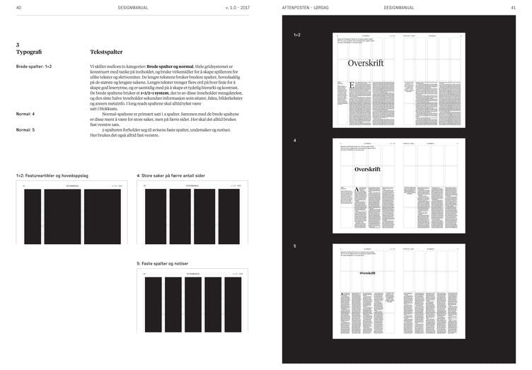
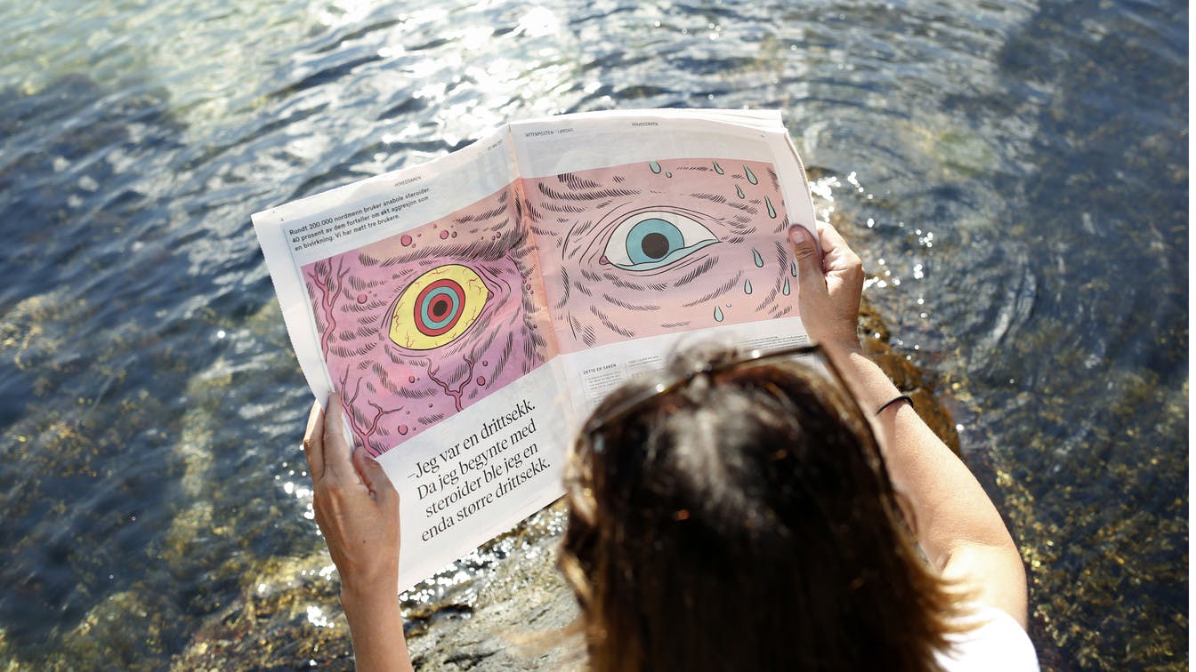
Photo: Tor G. Stenersen Illustration: Kristian Hammerstad, byHands