Found the solution in the archives A visual journey back to the origin
Strategy | Concept | Art direction | Campaign identity
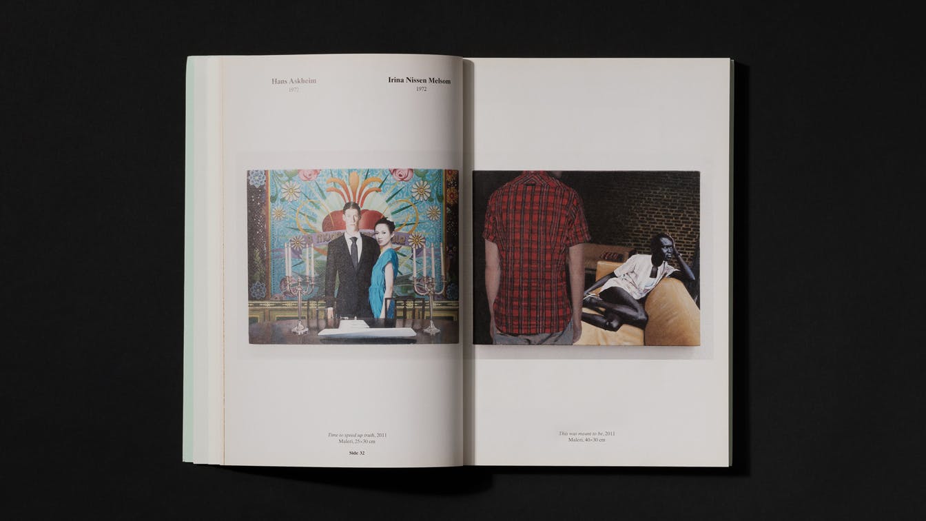
Controversial exhibition
Høstutstillingen (The autumn exhibition) is an annual event with 124 years of history. The exhibition is controversial, and is probably the exhibition in Norway that every year gets the most publicity in the media. The opinions are often divided, and the position and function of Høstutstillingen is often discussed.
The fact that an exhibition over s0 many years has received such a degree of attention was something we wanted to focus on in communication.
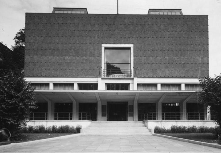
Kunstnernes Hus: Høstutstillingen has since 1930 been held at Kunstnernes Hus in Oslo
124 years: The first Høstutstillingen was held in 1882
Feedback over time
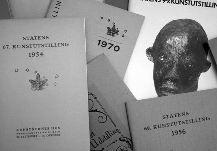
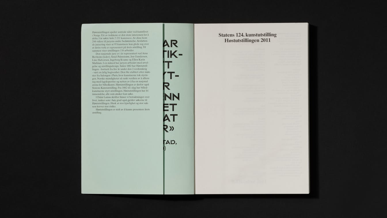
In the archives at Kunstnernes Hus we found all the catalogs that were made since the exhibition was arranged for the first time in 1882. We also got access to the countless reviews that have been published about Høstutstillingen over the years.
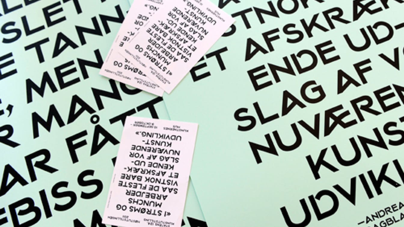
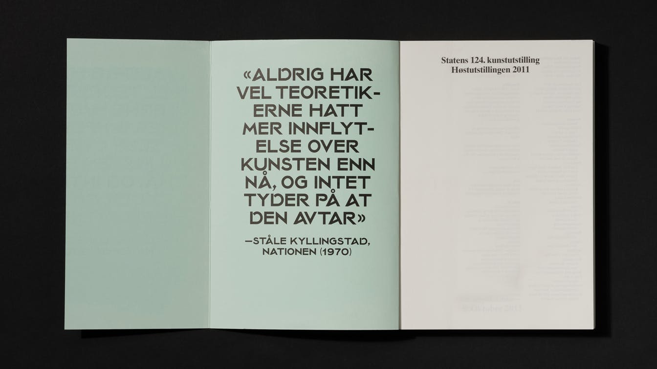
We chose to highlight selected historical reviews as part of the communication. The selection included both positive and negative feedback. This was done as a measure to communicate and create awareness regarding the historical position of Høstutstillingen, and to highlight the reaction the exhibition has been causing over the years.
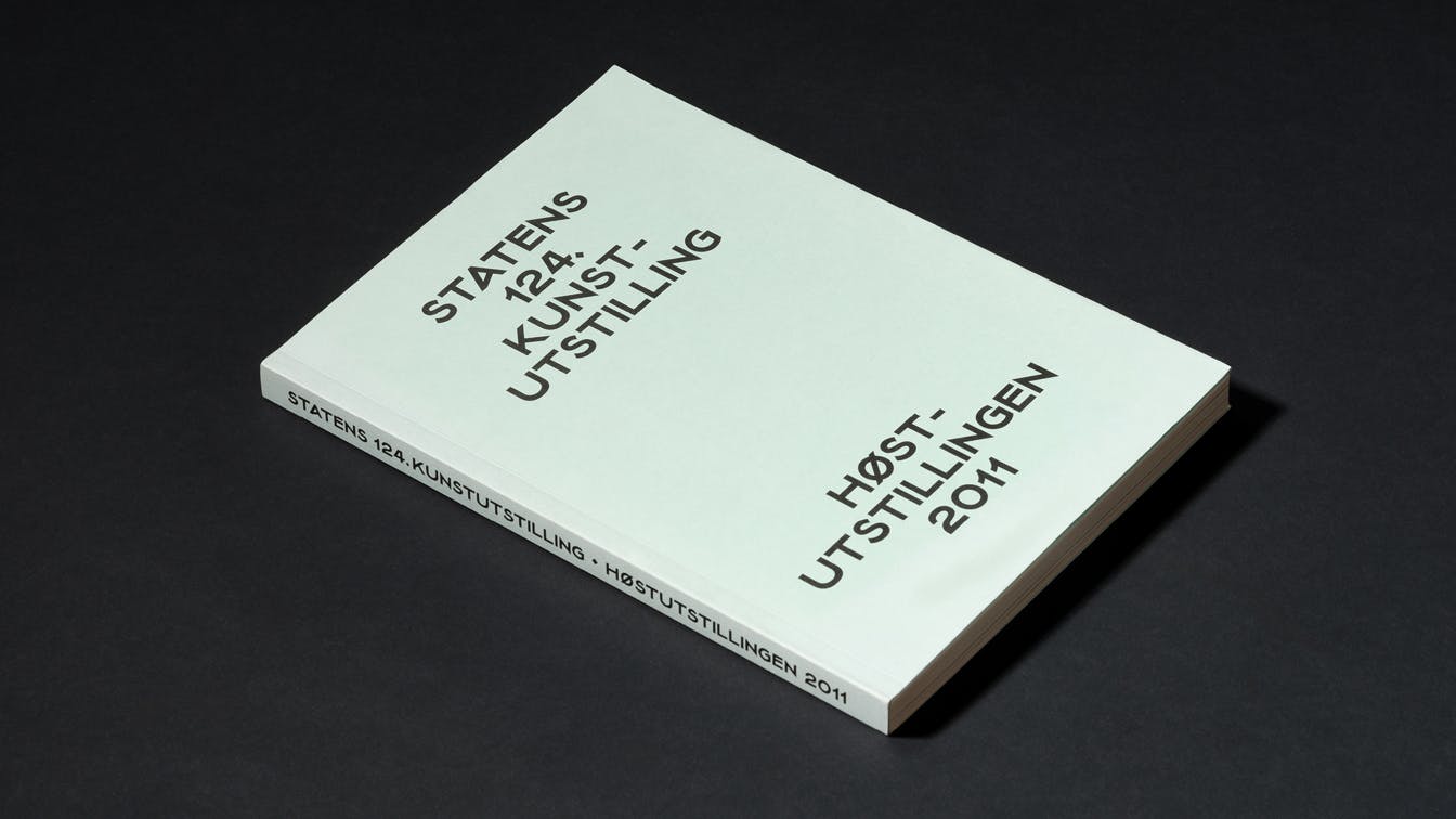

A typeface reborn
In the archives we discovered that Høstutstillingen at one stage had its own unique typeface. Today, the exhibition does not have a fixed visual identity - we therefore chose to revive and digitize the old typeface to this year's exhibition, which also became a visual reference to the long history of Høstutstillingen.