
Oil production and welfare Documenting an upbringing
Concept | Art direction | Editorial design
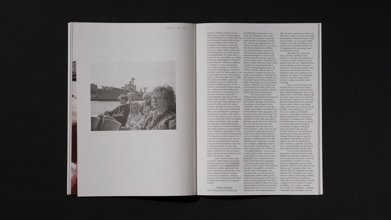
Vreng is the Norwegian version of the international magazine Adbusters. Each issue has a theme that takes a critical look at different aspects of society. When we were asked to work with the visual design of their latest edition, the theme was Norway as an oil nation, with texts discussing problematic aspects of Norway’s extraction of oil.
Visual contradiction
In several of Adbuster's earlier releases, both the text and the visual communication have a rather aggressive undertone. We wanted to challenge this convention and use the visual as a contrast and context to the editorial content. We wanted to give the reader space for their own interpretations and reflections, creating a magazine with a discussion and contradiction within itself.
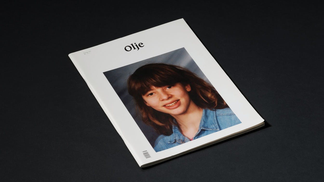
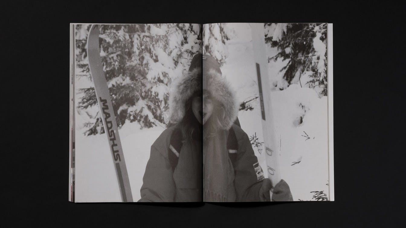
Documenting an upbringing in an oil producing nation
Norway's oil production has led to a number of welfare benefits, which the population of Norway has benefited from. This was the starting point for the visual concept. As the text conveyed the negative consequences, we wanted the visual to communicate the good.
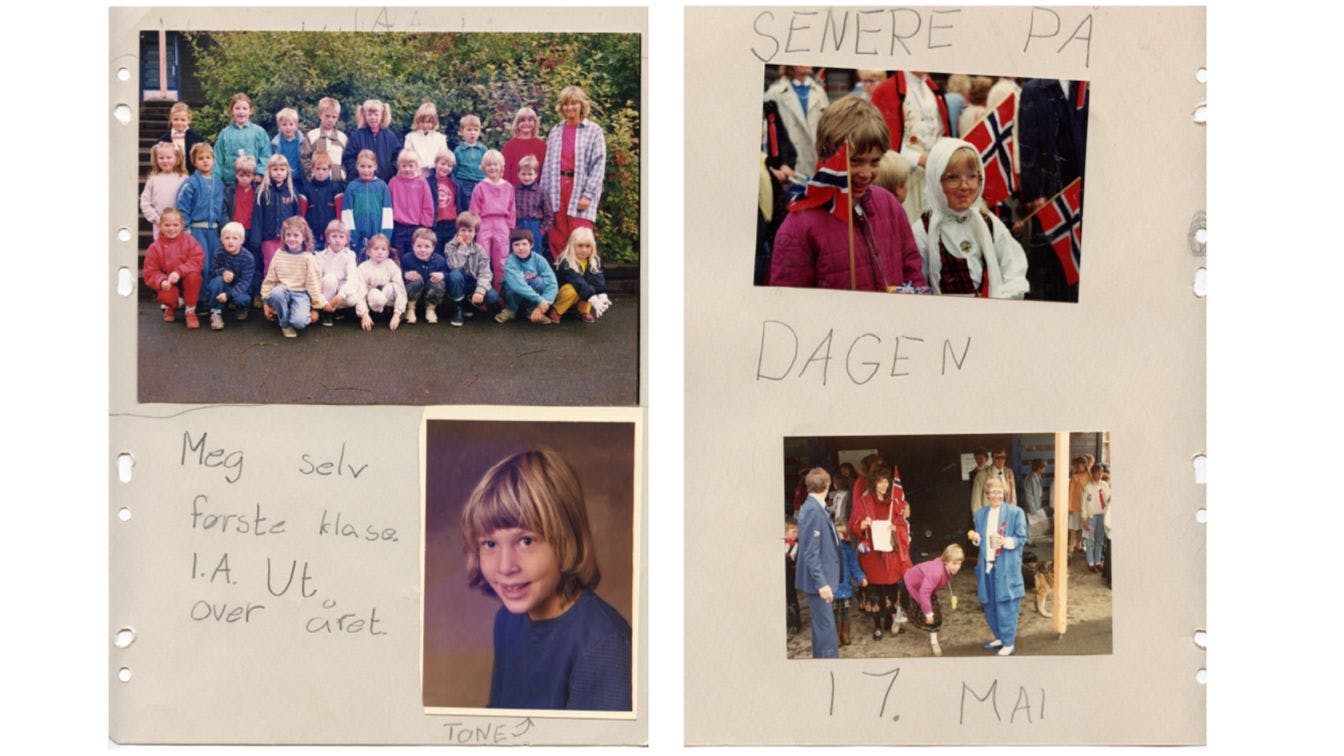
Photo: Privat
We searched for a person who had grown up in Norway during the period after the country became an oil and welfare nation. We wanted to use this person's upbringing as a context for the editorial content. Through her private photo album, we got access to images documenting a typical Norwegian upbringing – safe, with social goods and benefits. This became the visual context for the texts.
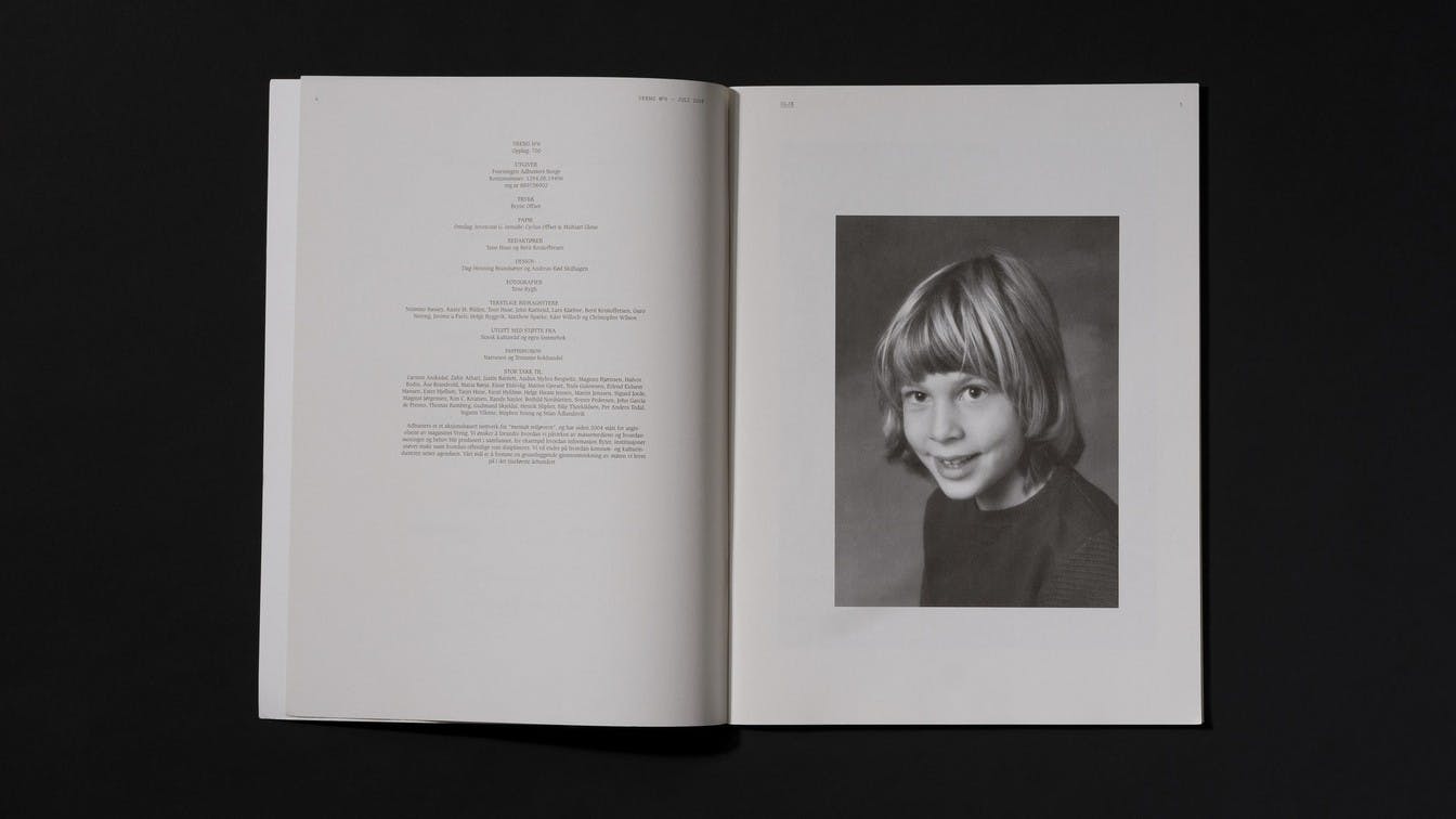
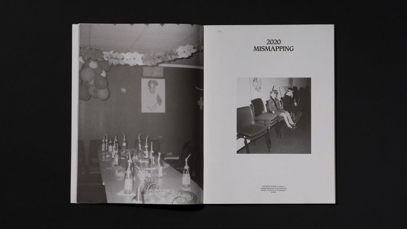
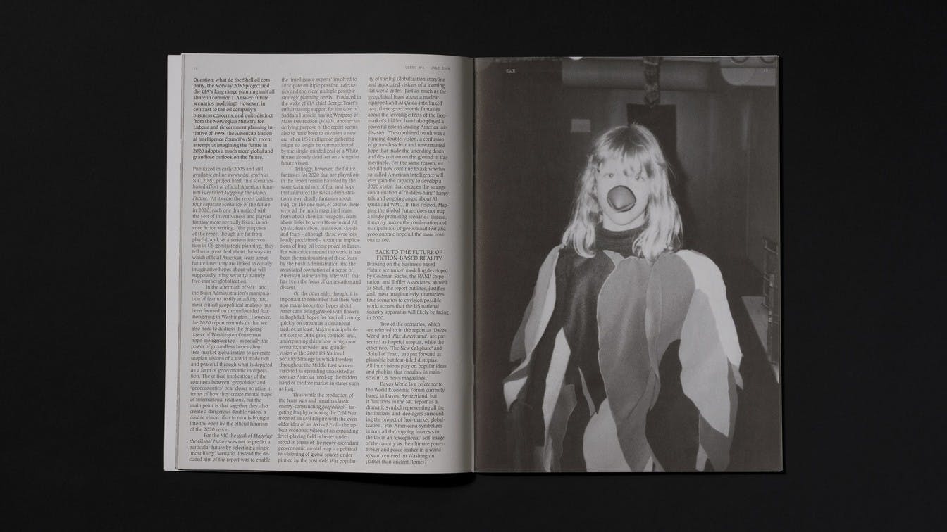
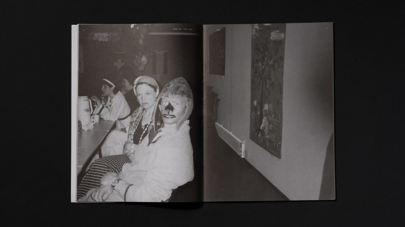
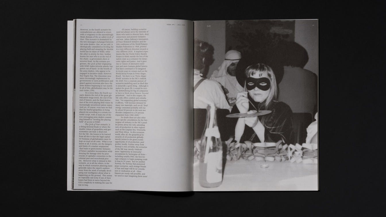
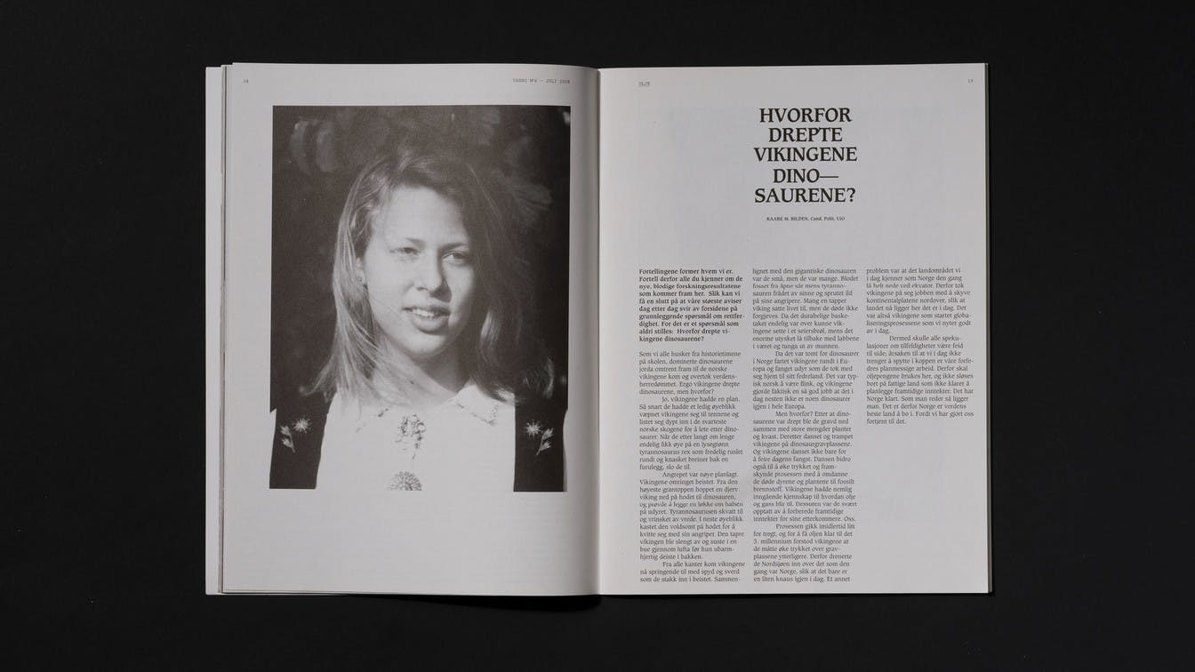
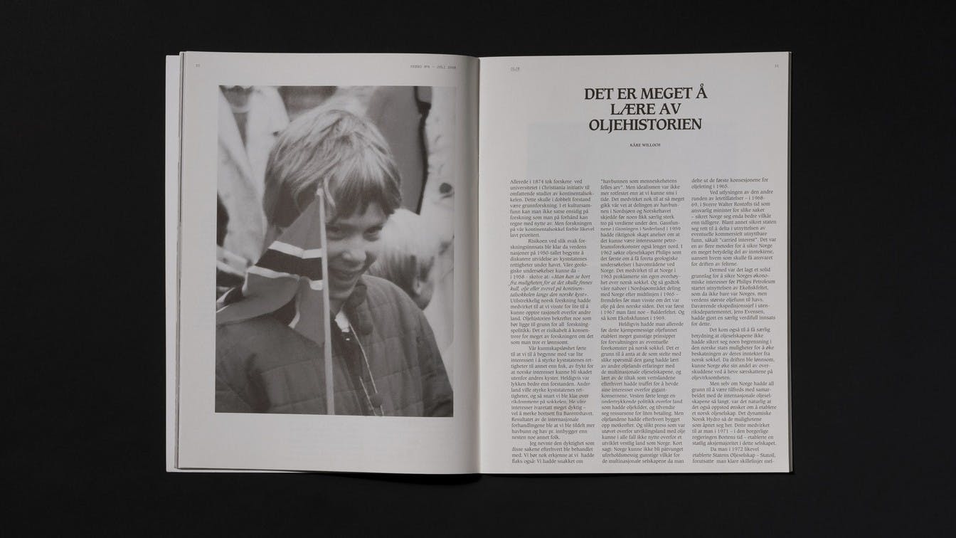
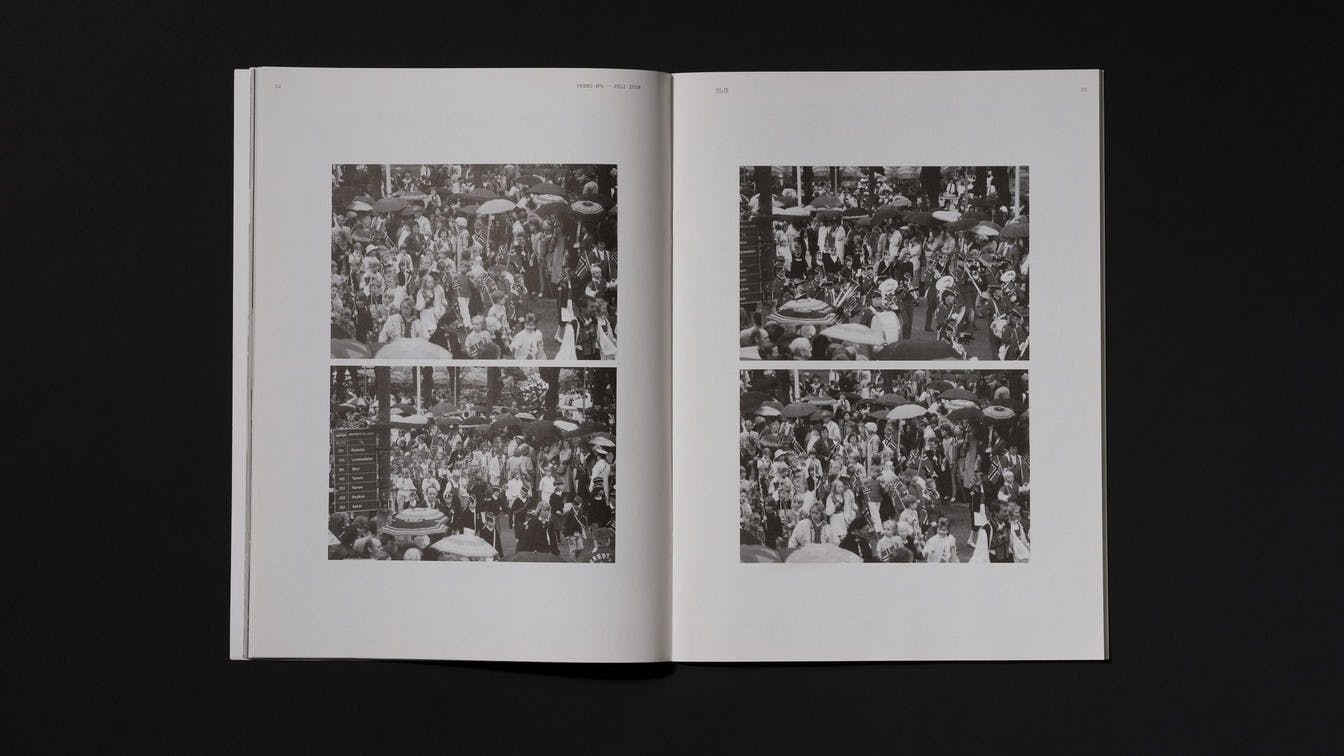
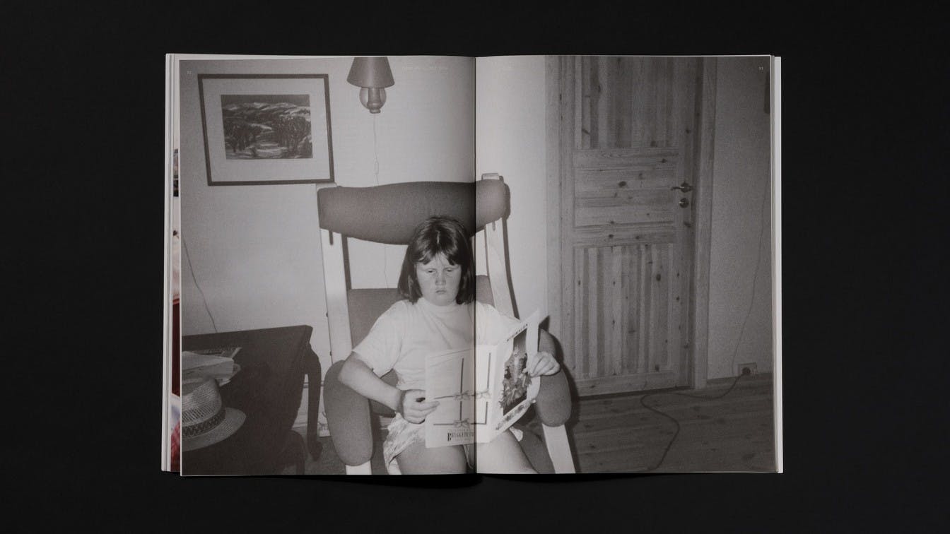
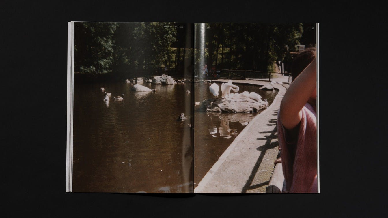
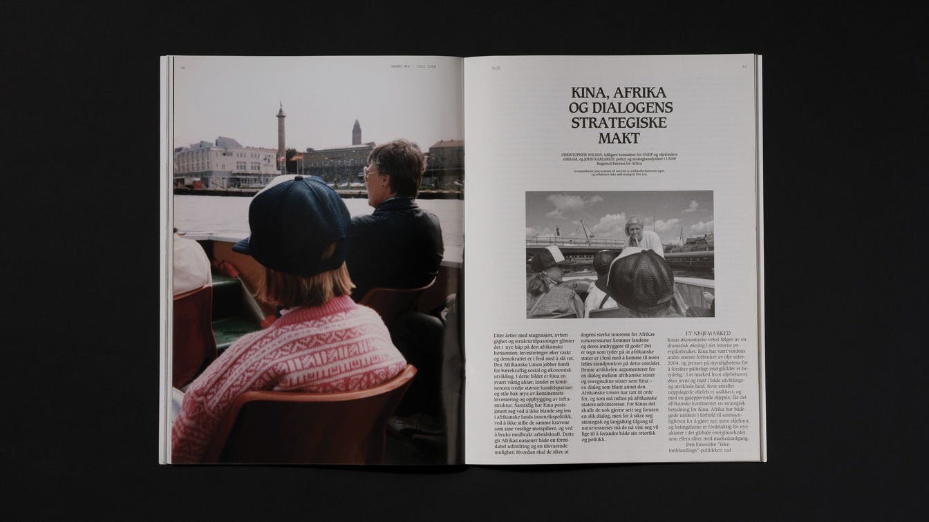
On the cover and the first pages of the magazine, we used portraits of the girl from different phases of her life, thus establishing the visual concept for the reader. Based on the texts, and particularly the headlines, we chose thematic photo series that created new layers of content.
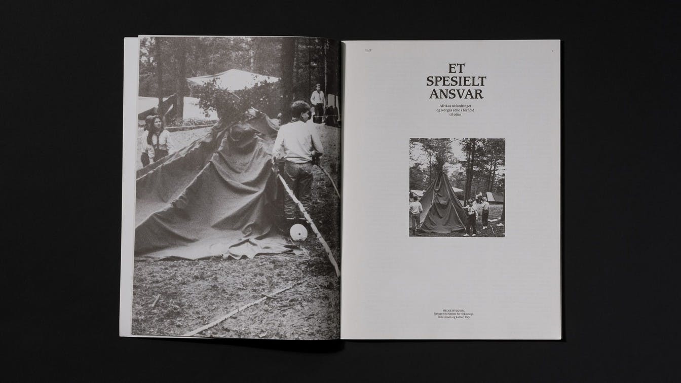
A text about the responsibility one has as an oil nation was juxtaposed with a photo series from the girl on a scouting trip. In the text about what consequences oil extraction has for the Arctic, we chose images from one of the girls ski-trips in the mountains.
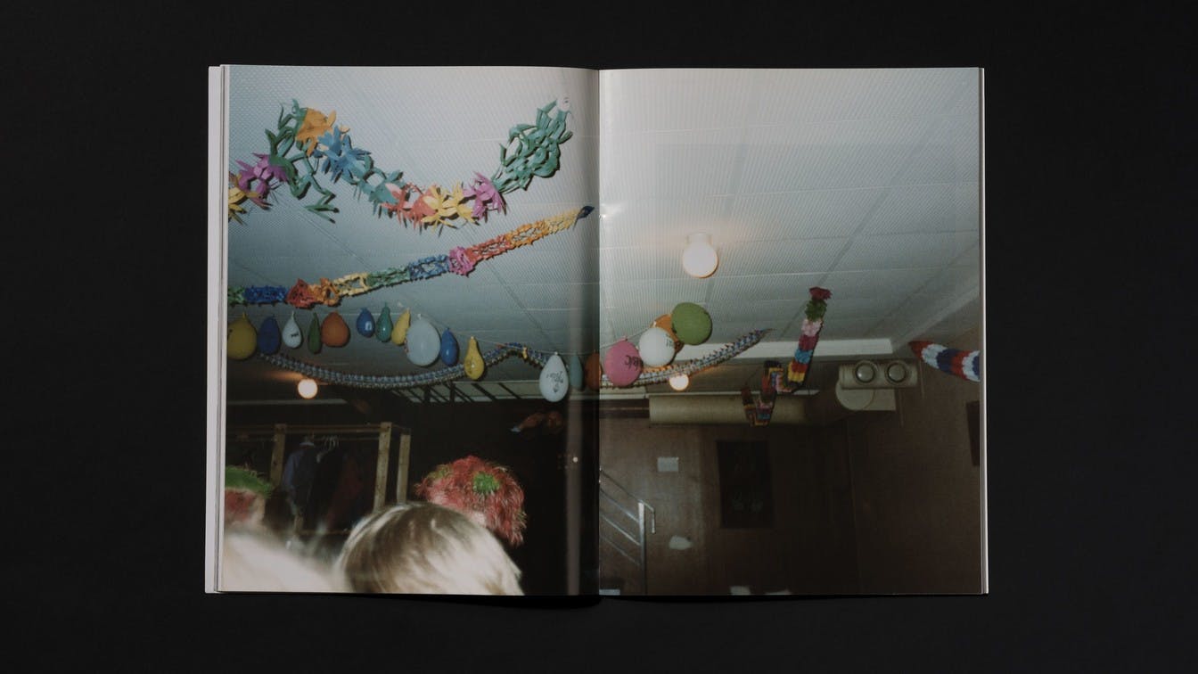
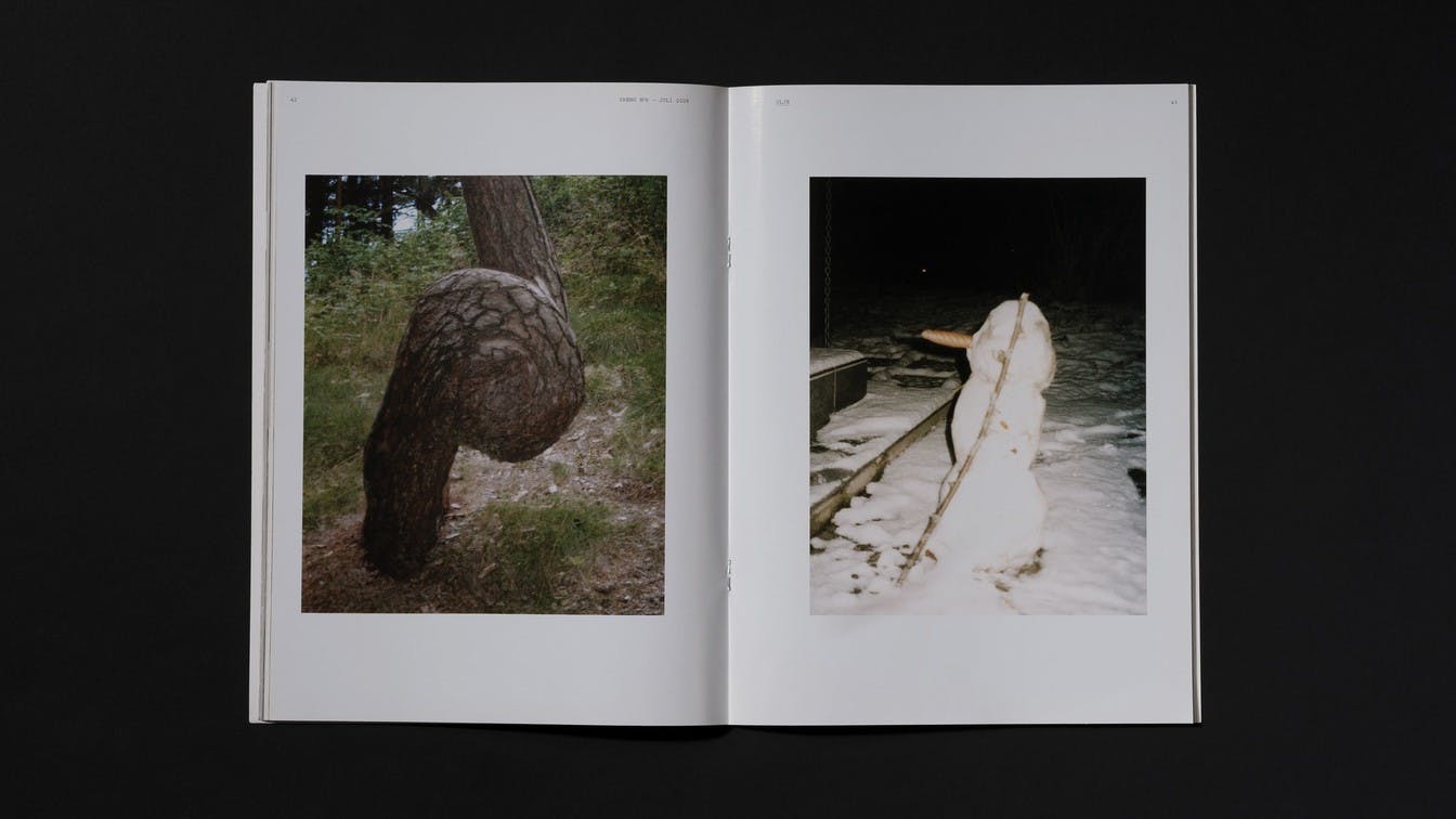
In the middle of the magazine we placed a series of more abstract and personal pictures. This served as a photo essay and a visual break in the magazine. This section was printed on coated paper to reinforce the distinction between the sections.
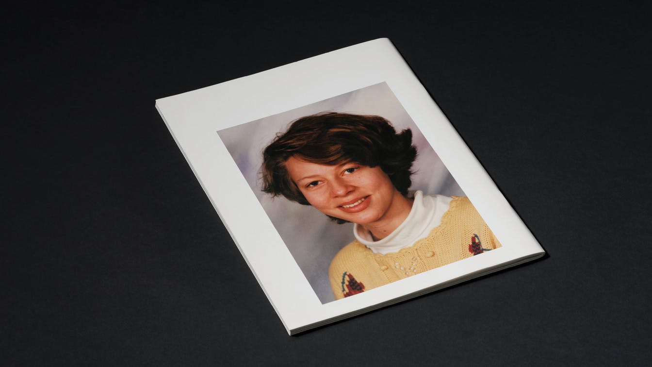
Photo: Einar Aslaksen