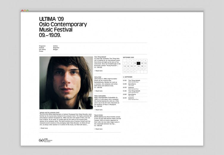
Ultima Oslo Contemporary Music Festival
Making contemporary music accessible From curatorial concept to visual communication
Strategy | Concept | Art direction | Visual identity | Campaign identity
The Ultima Festival is the Nordic Region's largest contemporary music festival. From 2009 to 2013, we worked on the communication of the festival, and developed the visual identity that is still used today.
NyMusikk-consert with Christine Sun Kim. Photo: Henrik Beck
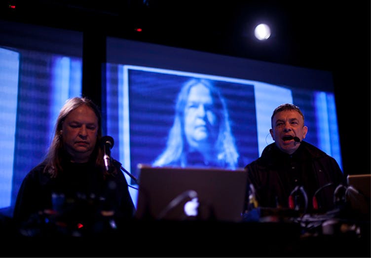
Karl Bartos, Dro Carey og Lukid på Blå. 2012. Photo: Elisabeth Høiberg
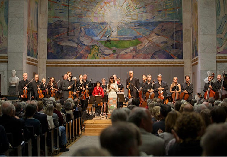
Det Norske Kammerorkester in universitetets aula, 2012. Photo: Elisabeth Høiberg
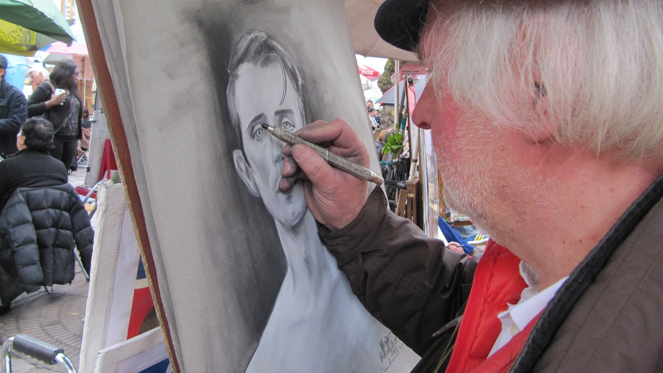
2013: Outsiders
The festival theme in 2013 was outsiders - people or genres, especially within the music, who fall outside the established.
Portrait drawers, who often sit in the center of well-known tourist destinations, fall under what one can call outsider art, or Art Brut - a visual language one rarely sees in established exhibition rooms or print media.
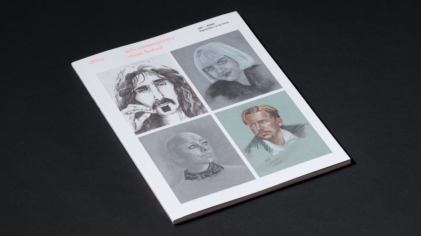
Photo: Einar Aslaksen
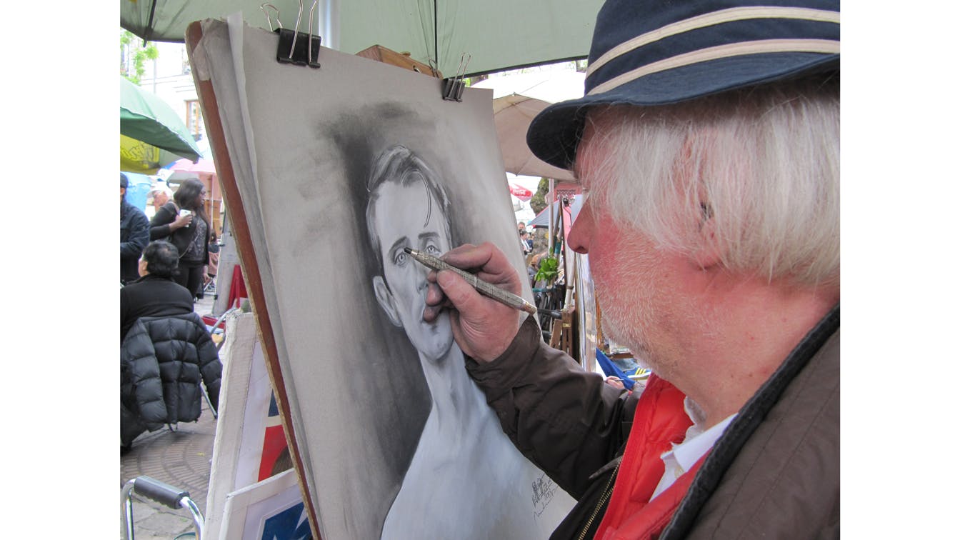
Photo: Erell Perrodo
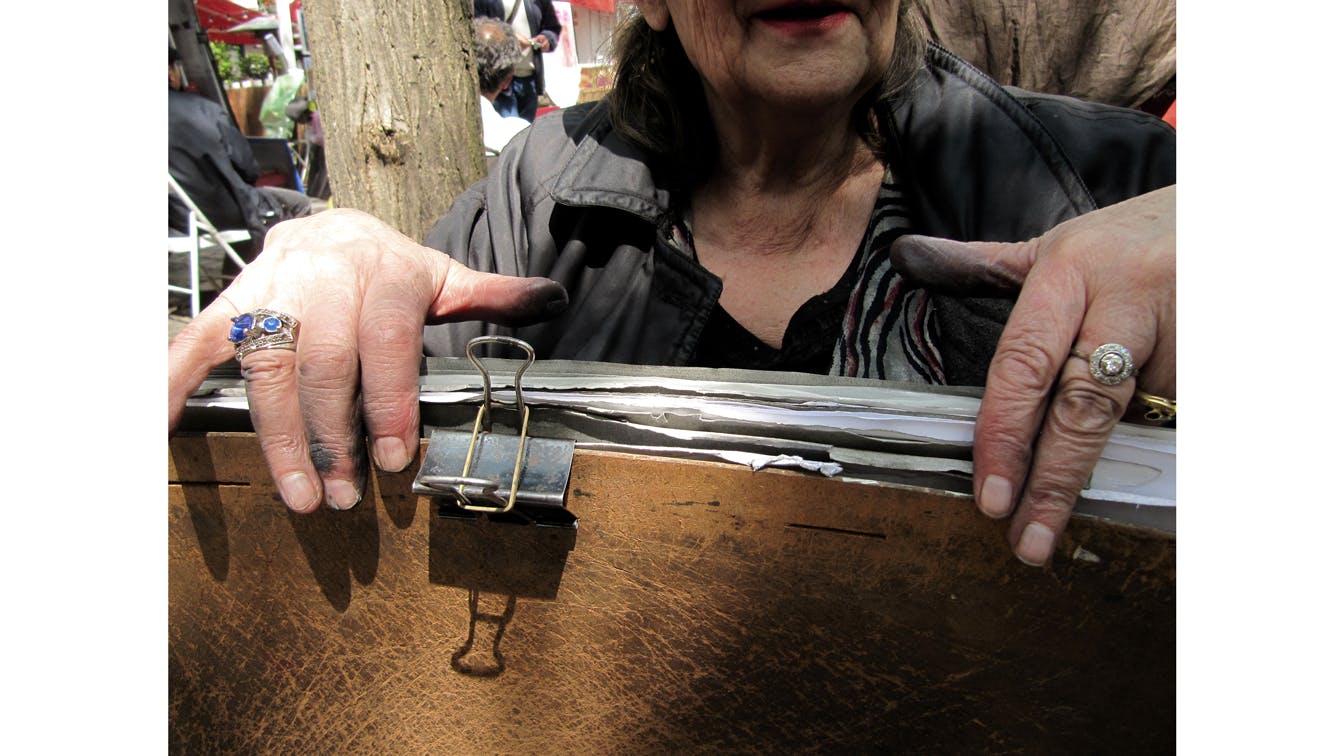
Photo: Erell Perrodo
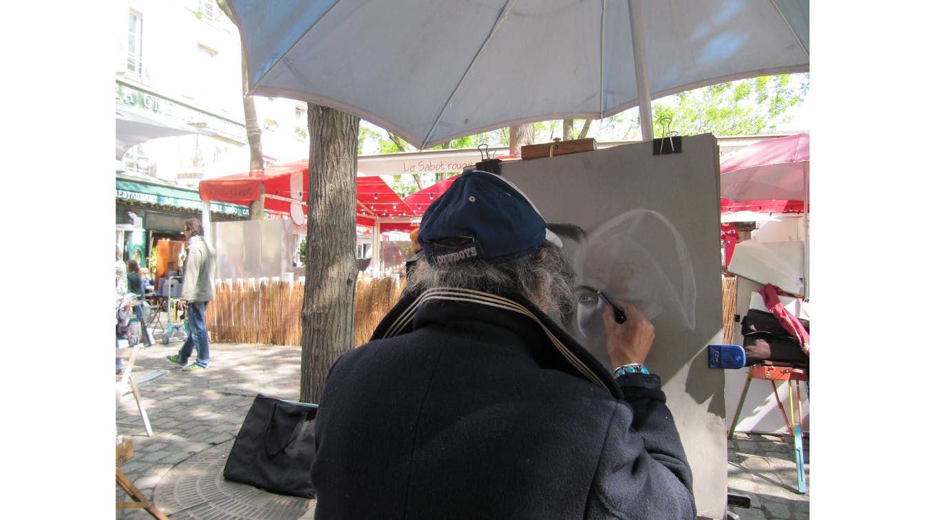
Photo: Erell Perrodo
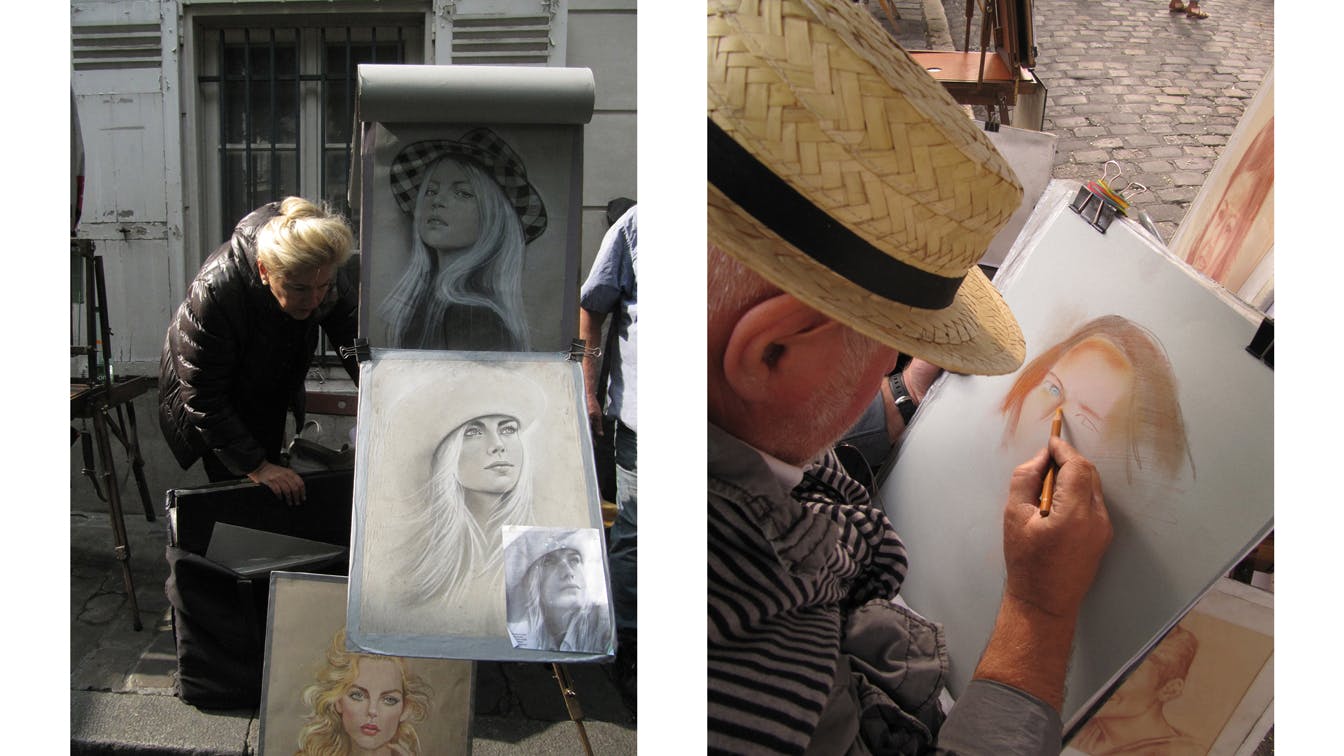
Photo: Erell Perrodo
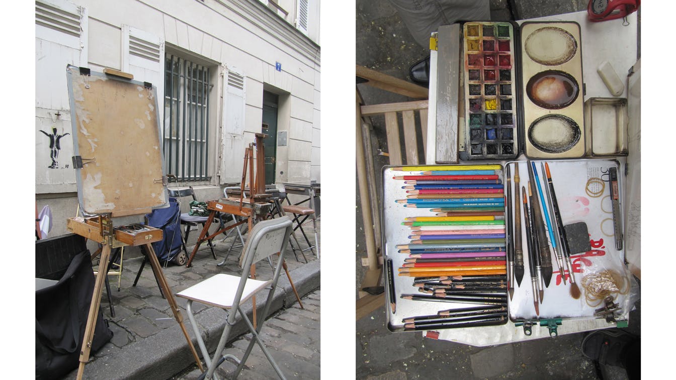
Photo: Erell Perrodo
Based on photographs of relevant musicians who were to perform at the festival, we got various street artists to draw portraits of them. The drawings provided a varied but comprehensive expression in the communication of the festival.
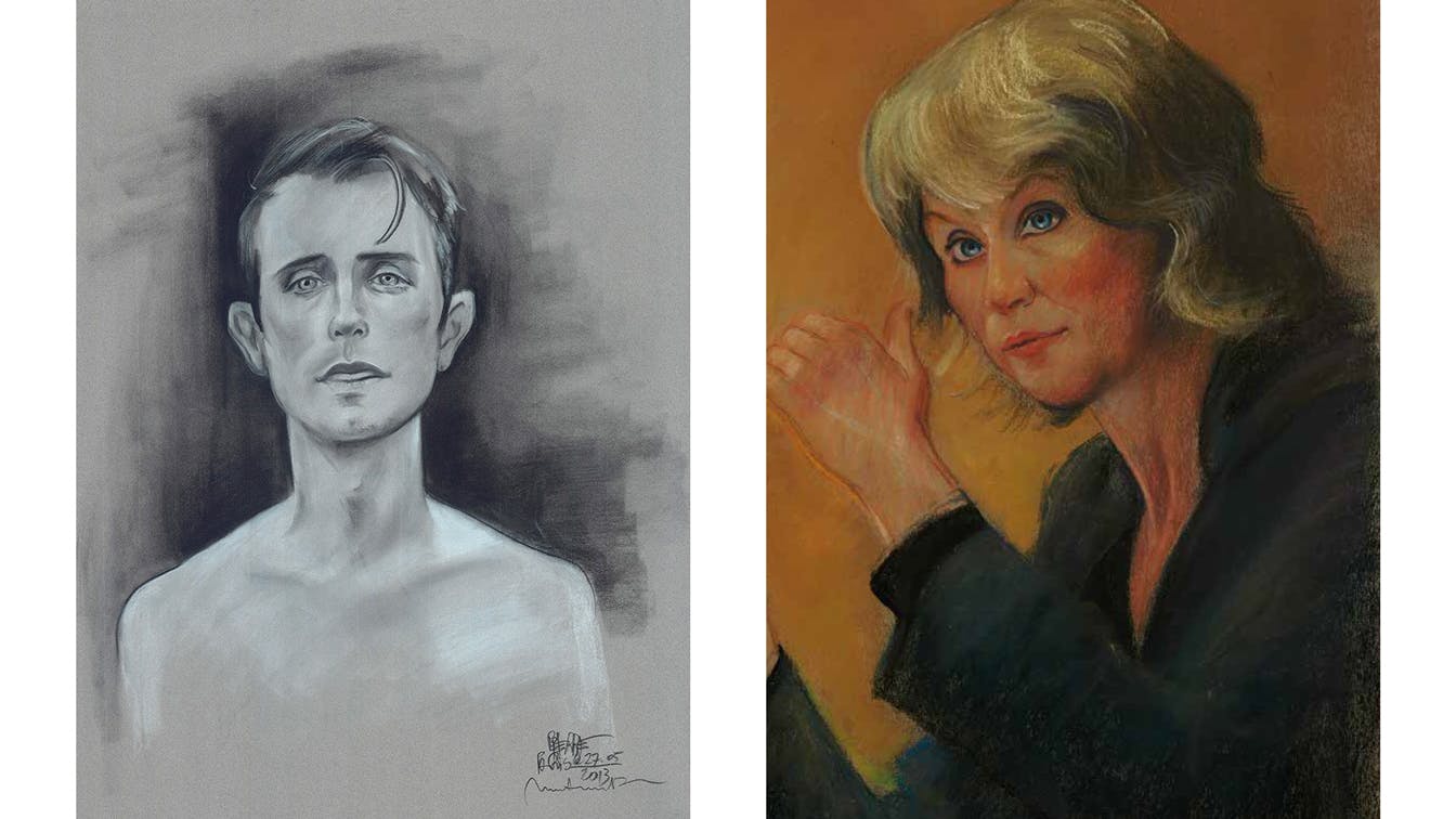
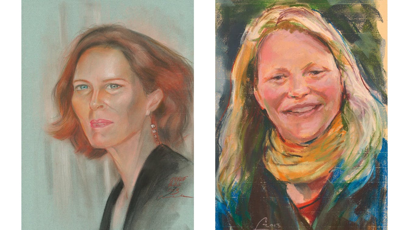
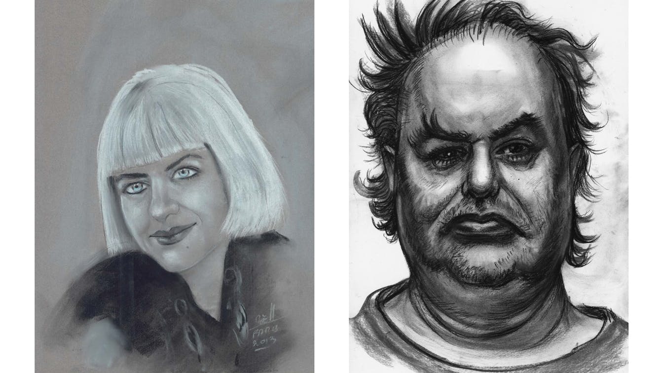
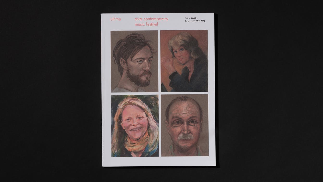
Photo: Einar Aslaksen
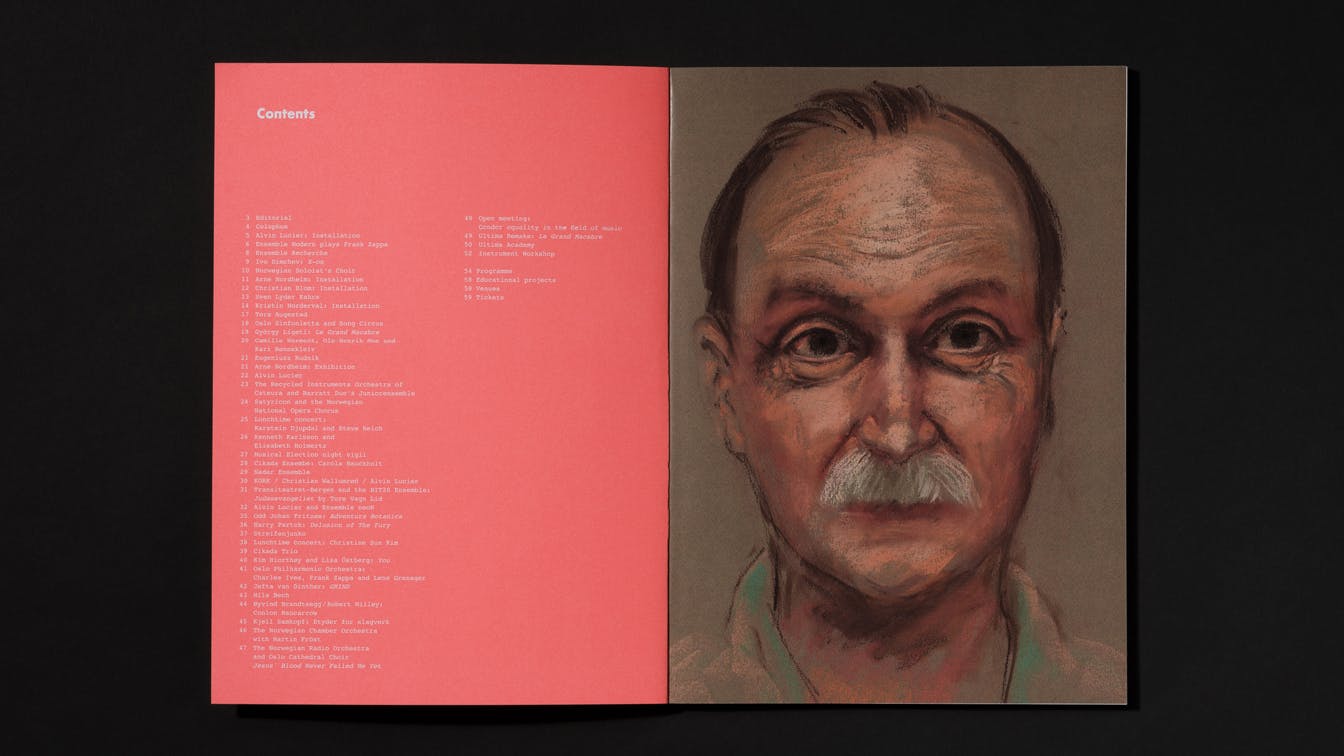
Photo: Einar Aslaksen
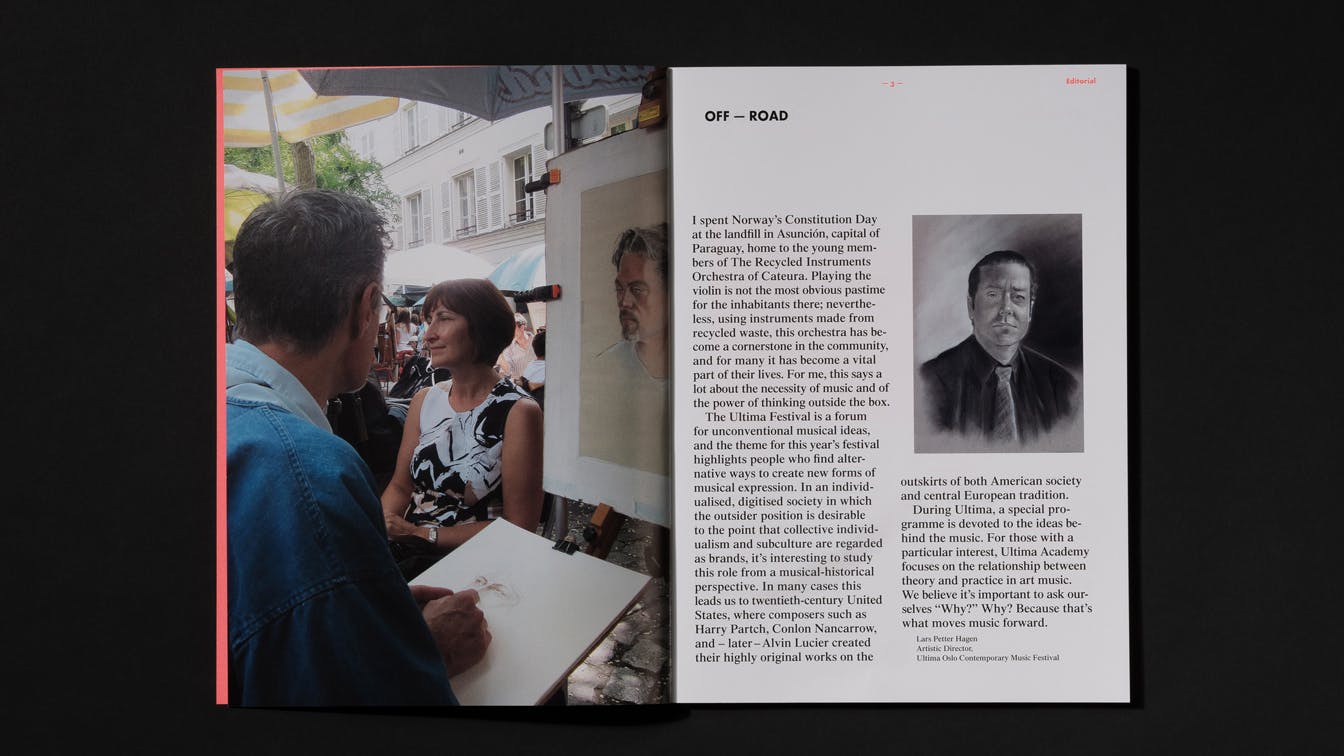
Photo: Einar Aslaksen
Photo: Einar Aslaksen
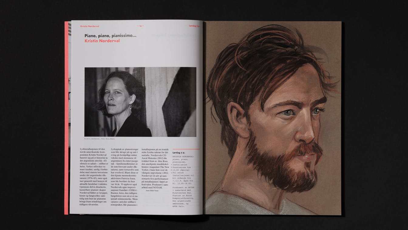
Photo: Einar Aslaksen
Photo: Einar Aslaksen
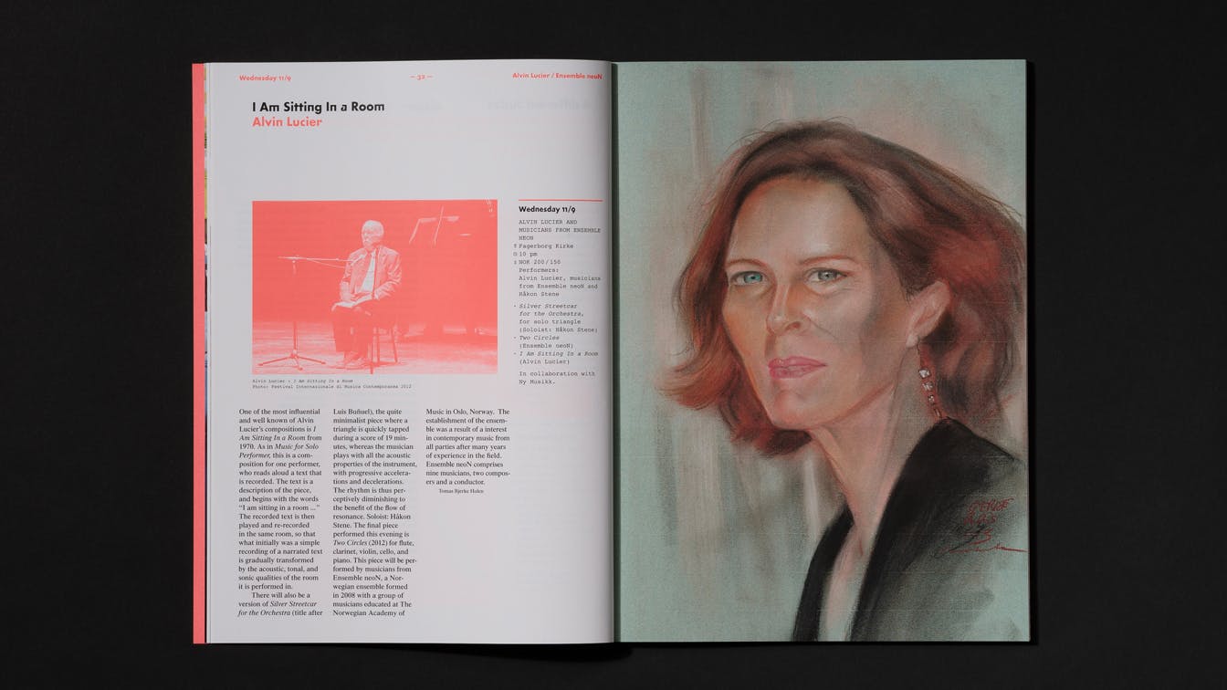
Photo: Einar Aslaksen
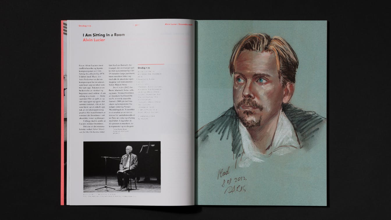
Photo: Einar Aslaksen
Photo: Einar Aslaksen
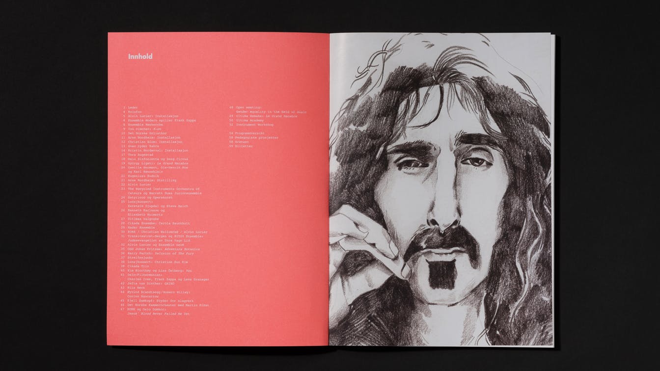
Photo: Einar Aslaksen
2012: List
The festival theme in 2012 was about writing lists - lists of favorite songs, people involved in a performance or songs performed at a concert.
Based on the content of the festival, we wanted to create a list of all the textual content that was to be communicated. All text that was to be distributed in the marketing, such as festival newspaper and festival magazine, was scanned and sorted.
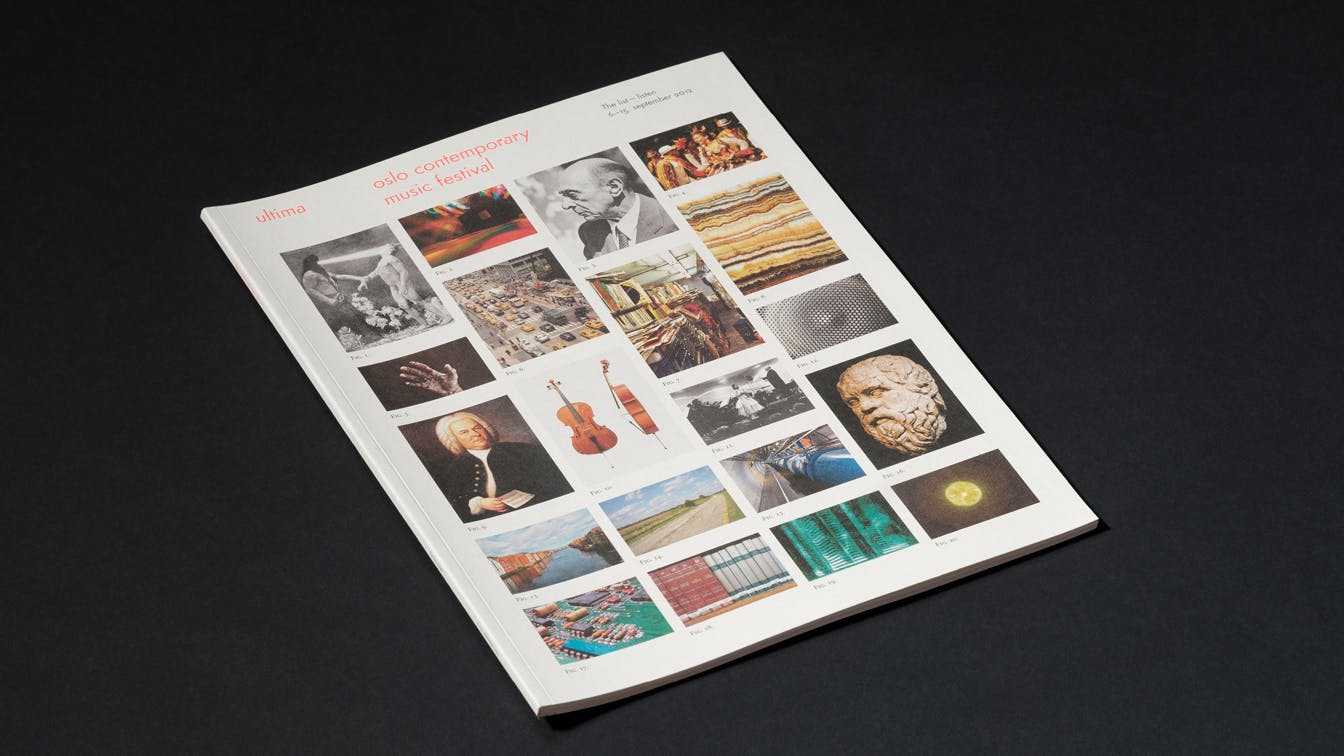
Photo: Einar Aslaksen
Using a specially developed software, we sorted all individual words based on the number of times the word appeared in the relevant texts. Based on this list, each word was given a visual interpretation based on the word's presentation in encyclopedias such as Wikipedia - everything from a state of mind to concrete objects, such as an instrument. The images were then placed in a visual index, which shaped the starting point for the festival's visual communication.
Photo: Einar Aslaksen
Photo: Einar Aslaksen
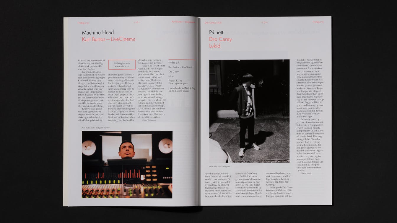
Photo: Einar Aslaksen
Photo: Einar Aslaksen
Photo: Einar Aslaksen
Photo: Einar Aslaksen
Photo: Einar Aslaksen
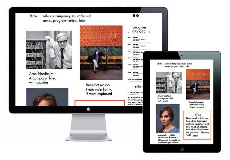
Photo:Elisabeth Høiberg
Identity
Throughout the previous years, we changed the visual profile of Ultima every festival. In 2012, it was decided that Ultima should have a fixed sender identity, but that the communication concept should be unique and adapted each year to its theme.
When we were asked to develop a new identity for Ultima in 2012, we chose to focus on the roots of contemporary music in the early, experimental phase of modernism. We were fascinated by the early drafts of Paul Renner's Futura font - one of the most successful fonts associated with the "Neue Typographie" movement.
The earliest version of Futura, launched in 1927, contained alternative, radically new designs of letters such as "a", "m" and "r" - based on geometric design principles - a violation of the traditional forms derived from handwriting and calligraphy .
An intense, untraditional, red color was used actively as part of the visual profile. By using a framing on ads, and other materials, the message could be clearly distinguished in spite of much textual information.
The red color served as a recognizable element on various surfaces in the cityscape during the festival. When a number of different concert venues are used, and often places the audience has not previously been, the color helped to guide people in the right direction.
2011: Transformation
The festival theme in 2011 was transitions and transformations - how music develops gradually and becomes something completely new over time.
Using a Google Images search, one can upload an image, and then displaying other images with visual similarities. We chose to use this tool as a starting point for communicating and visualizing the idea of gradual transitions.
Photo: Einar Aslaksen
Photo: Einar Aslaksen
Photo: Einar Aslaksen
Photo: Einar Aslaksen
We used the pictures of the various artists who would perform at the festival as a starting point. The images were uploaded via Google, and the result was a collage of visually related images without any other link beyond the aesthetic qualities. By placing the artists together with the generated images, a visually sliding transition occurred - a transformation.
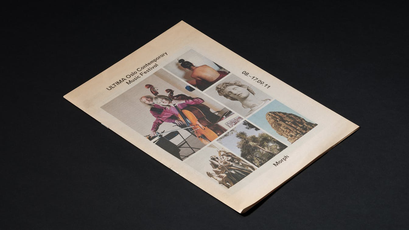
Photo: Einar Aslaksen
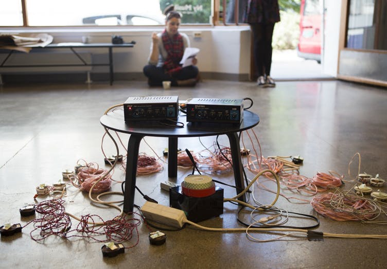
2010: Crafts
The festival theme in 2010 was crafts. What is good craftsmanship? What happens if you separate an idea from implementation?
Through a festival program that contained everything from educated musicians to self-taught composers, the audience got an insight into discussions around craft. A schooled musician can be a skilled at the craft, but education can also limit new ideas and the ability to experiment. On the other hand, an unskilled practitioner can break with established conventions, but at the same time be in danger of failing in the technical implementation.
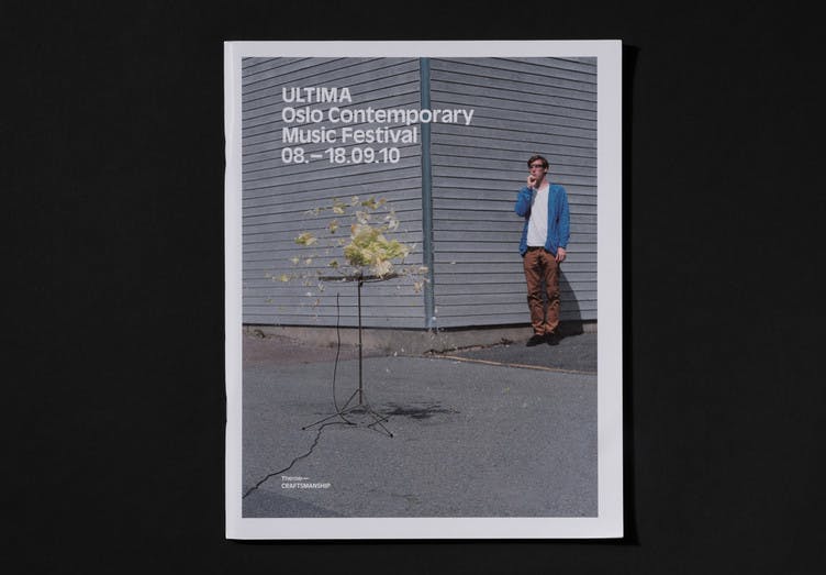
Photo: Einar Aslaksen
Photo: Einar Aslaksen
The art movement Fluxus addressed this theme. Is it the idea or implementation that is important? So-called Fluxus instructions contain recipes for works of art, where the artists themselves thought that the work was finished as soon as the idea was written down - the implementation was secondary. We decided to complete, and document, several of the written Fluxus instructions.
Photo: Einar Aslaksen
Photo: Einar Aslaksen
Photo: Einar Aslaksen
Photo: Einar Aslaksen
Photo: Einar Aslaksen
Photo: Einar Aslaksen
Photo: Einar Aslaksen
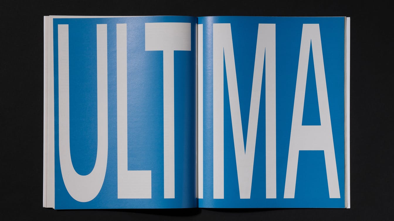
Photo: Einar Aslaksen
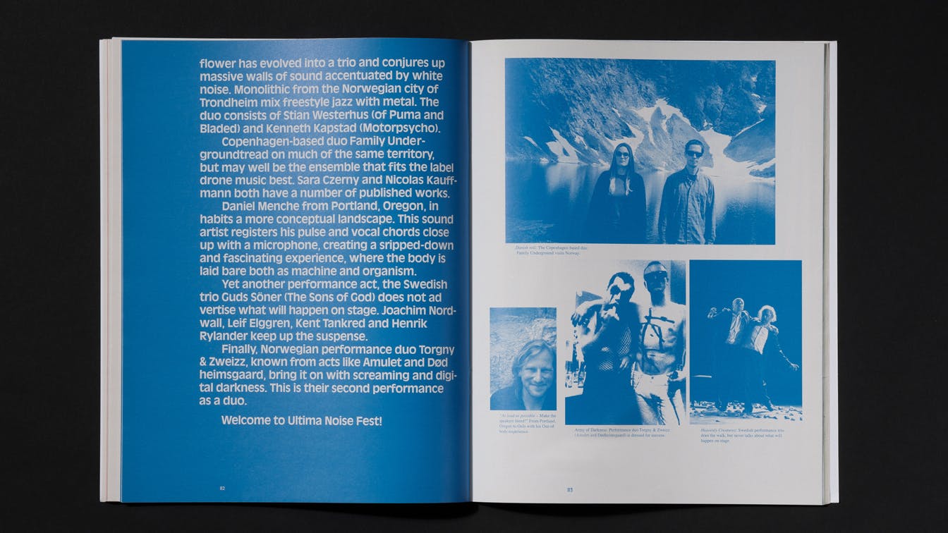
Photo: Einar Aslaksen
A festival was also arranged within the festival focusing on noise music, which got its own visual profile. The idea was to adapt the text to the different surfaces and formats. We therefore scaled the text so that it ended up with a deconstructed and incorrectly proportioned expression.
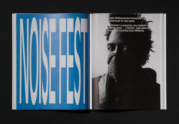
Photo: Einar Aslaksen
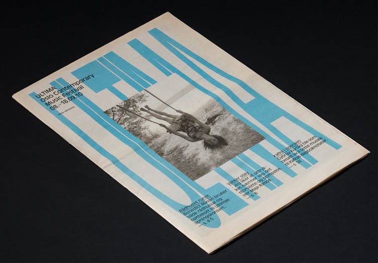
Photo: Einar Aslaksen
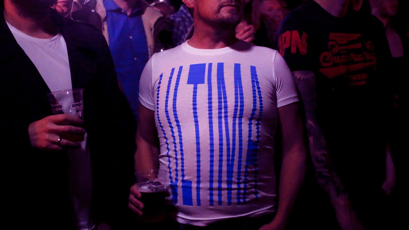
Photo:Monica Strømdahl
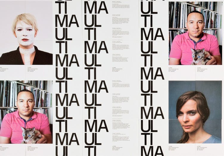
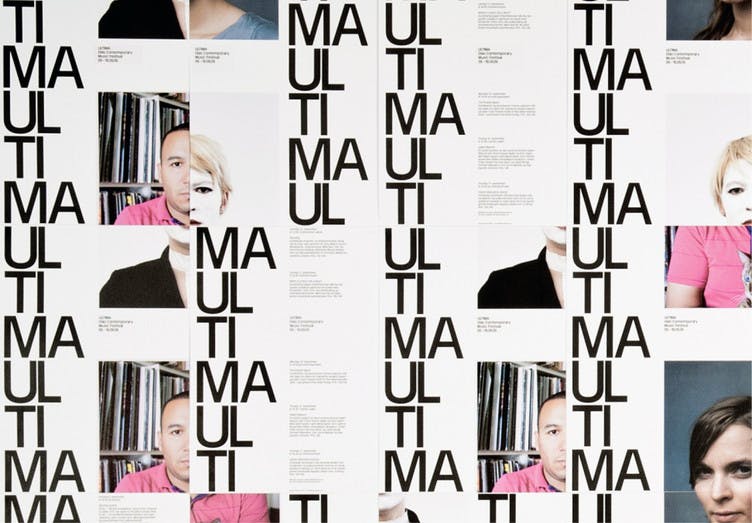
2009: Rewriting
The festival theme in 2009 was about rewriting music. This was translated in the program through everything from new interpretations of existing works to sampling and pure cover artists.
We took inspiration from, among others, Exercises in Style - a book written by Raymond Queneau, which deals with a single story told and rewritten, in many different ways.
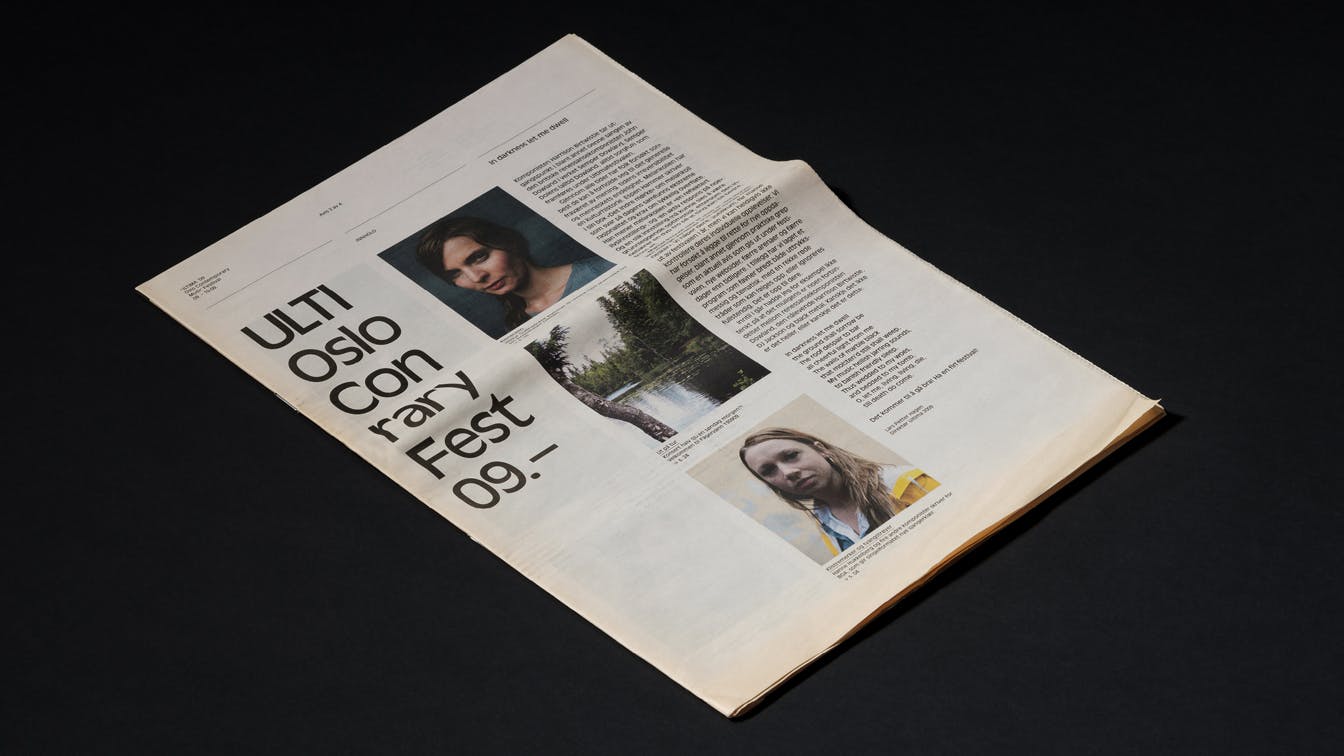
Photo: Einar Aslaksen
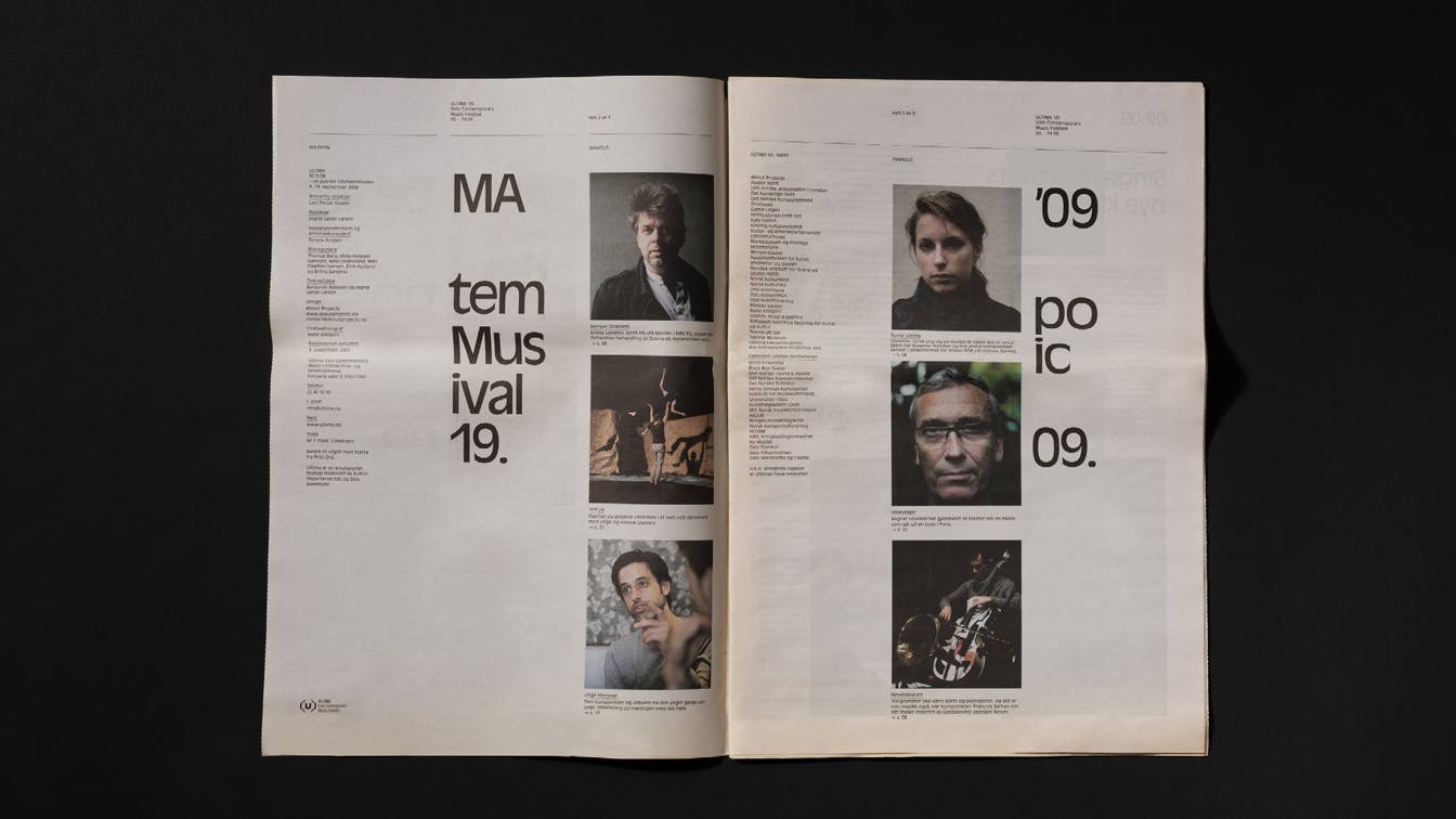
Photo: Einar Aslaksen
Photo: Einar Aslaksen
Photo: Einar Aslaksen
Photo: Einar Aslaksen
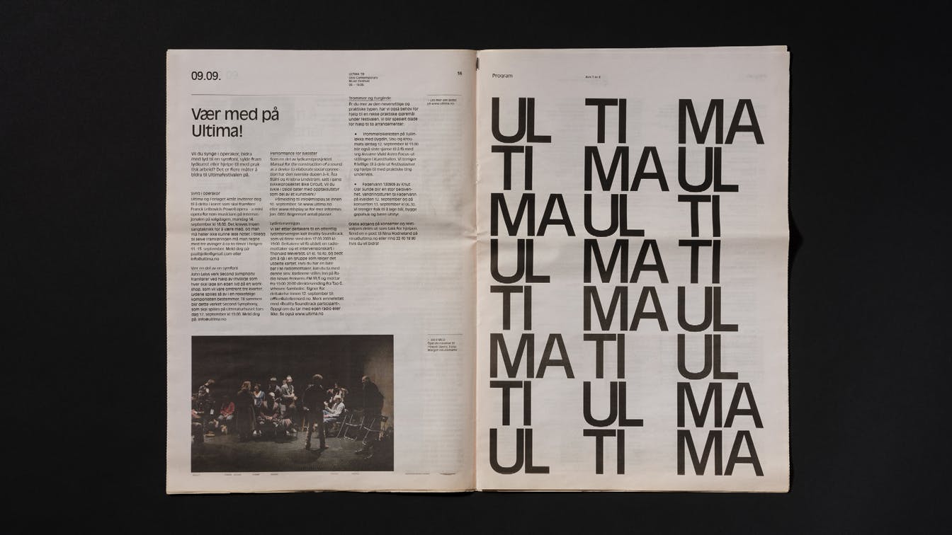
Photo: Einar Aslaksen
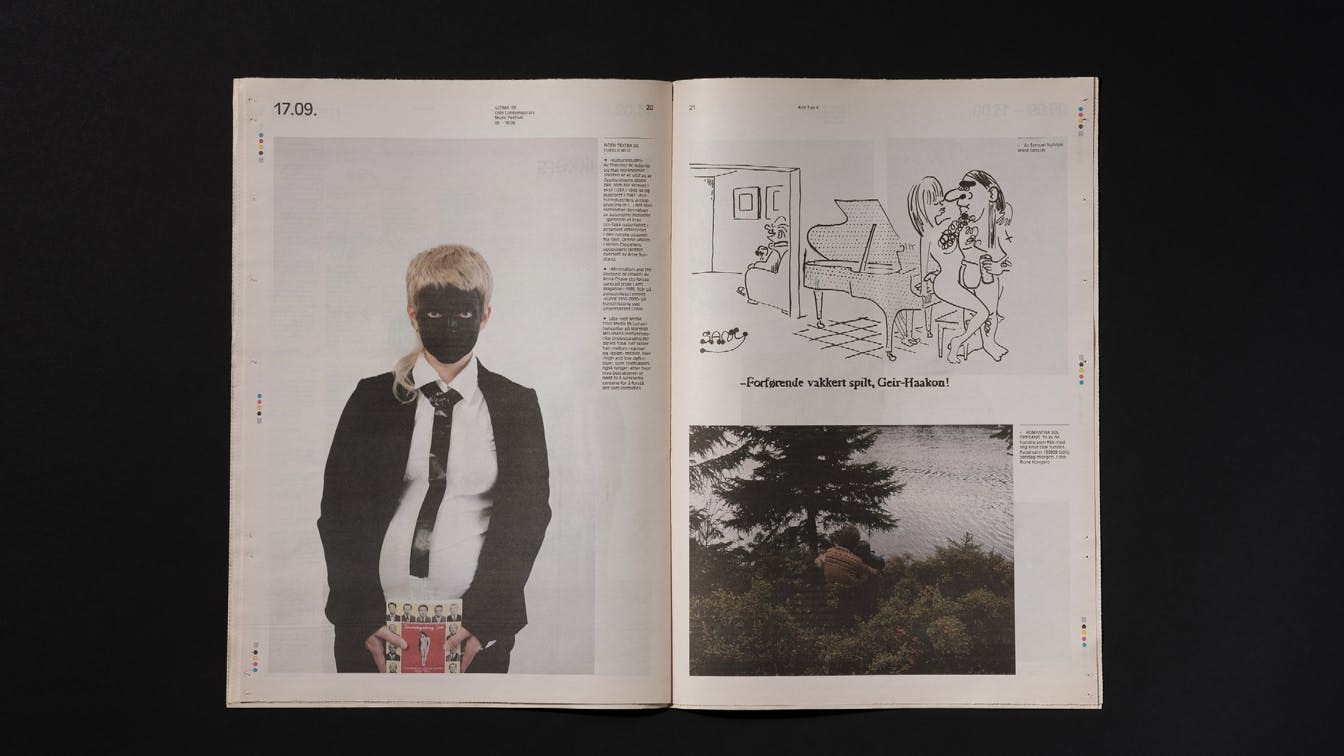
Photo: Einar Aslaksen
Illustration: Samuel Nyholm
Another source of inspiration was William Burrough's cut-up technique. The exercise involves that text columns are divided and shuffled, and then creating new interpretations of the same content.
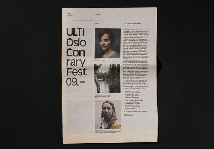
Photo: Einar Aslaksen
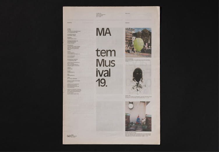
Photo: Einar Aslaksen
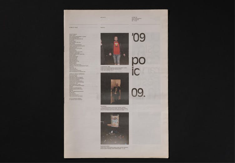
Photo: Einar Aslaksen
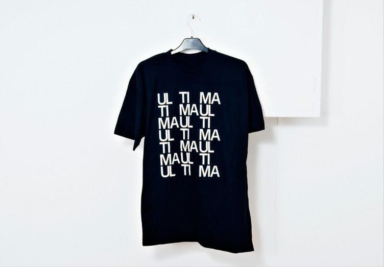
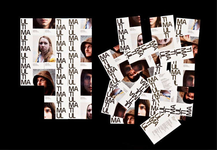
With this as a starting point, we explored the possibility of shuffling the syllables and creating new names of Ultima, the name of the festival. Kurt Schwitters' work Ursonate, also a well-known work in contemporary music, deals with such a division of words by pronunciation and syllable.
UL TI MA MA UL MA UL TI
All communication surfaces were divided into slots that could be relocated to create new interpretations and compositions.