HKW Haus der Kulturen der Welt
A history with new relevance One identity, varying content
Strategy | Concept | Art direction | Visual identity | Campaign identity
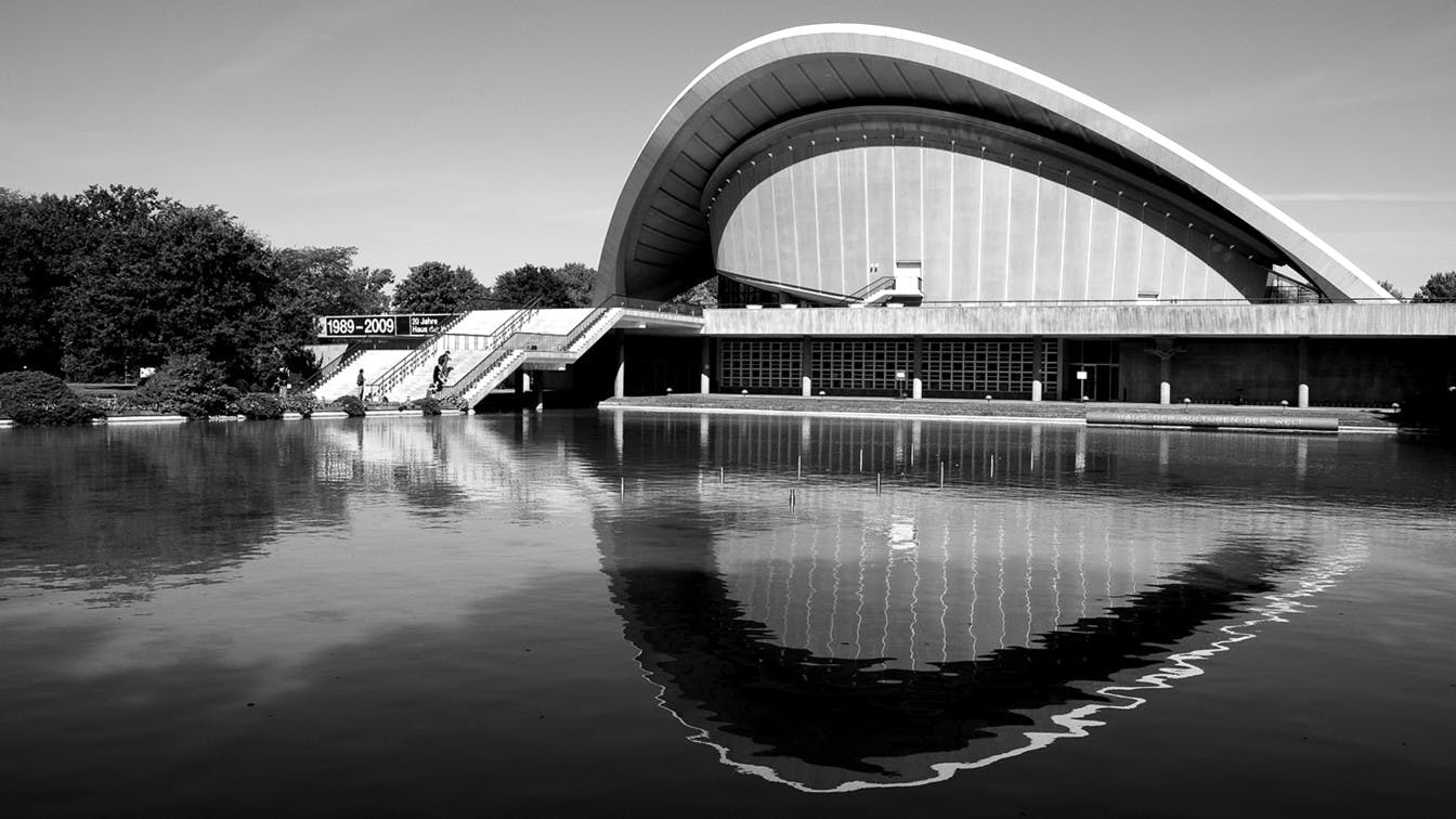
Haus der Kulturen der Welt (HKW) is one of the most important cultural institutions in Berlin, and the home to exhibitions on art, music, literature and film.
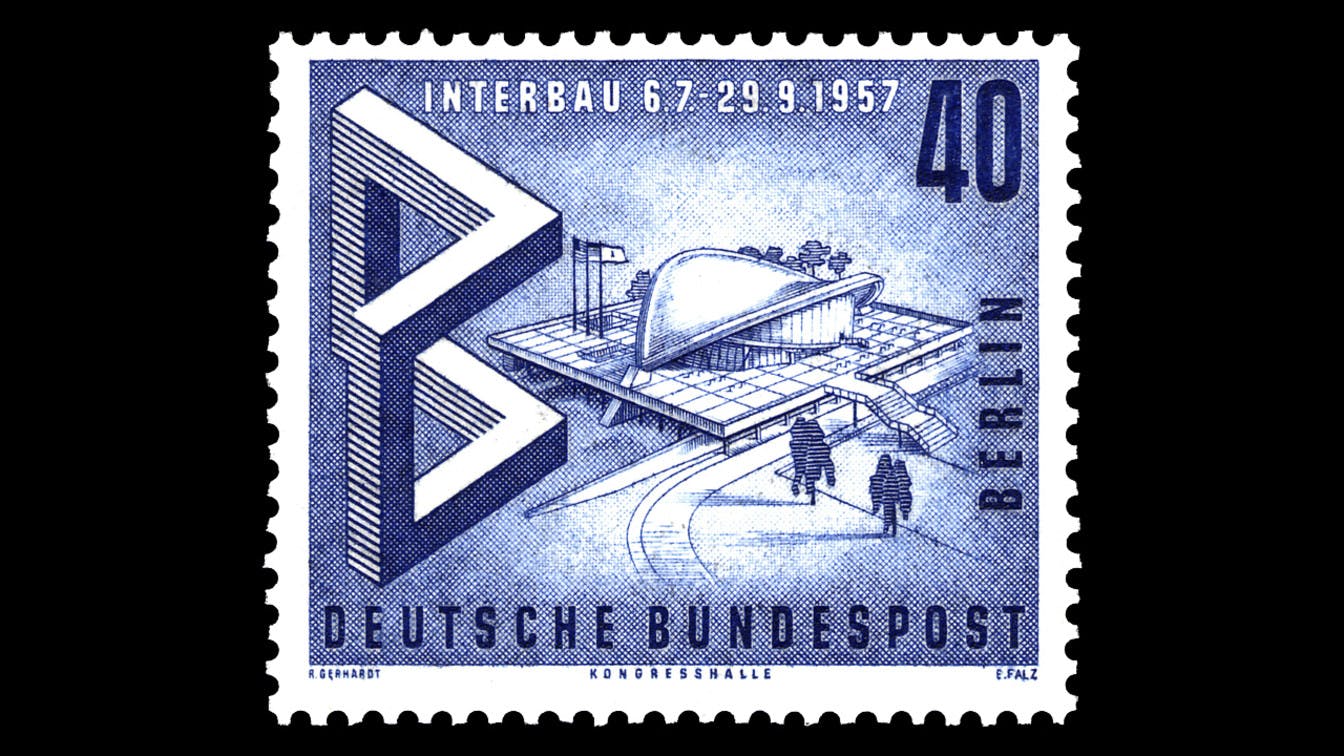
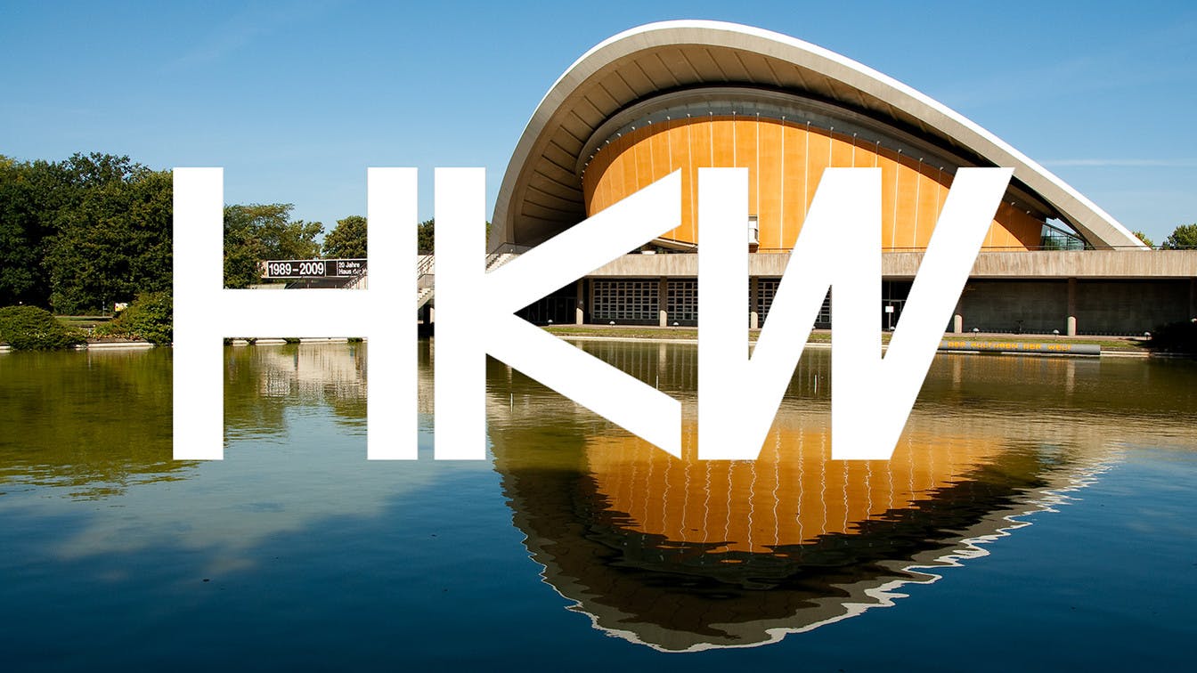
Interbau: Haus der Kulturen der Welt was part of Interbau, the international building exhibition in 1957 in the Hansaviertel area of Mitte in Berlin. 48 architects participated in the project, and Haus der Kulturen der Welt was designed by Hugh Stubbins.
Change of focus
HKW has a long and complicated history, and was the symbol of the West when it was built in West Berlin in 1957. In recent years, HKW has changed its position in Berlin. The main objective is no longer to show exotic and foreign cultures, but to be a place for cultural exploration and debate in general.
This change meant that the full name, Haus der Kulturen der Welt, was to appear secondary, with the abbreviation HKW as the primary name. They still wished for a visual identity based on and complimenting Hugh Stubbin's architecture, but with a less static expression compared to the previous identity.
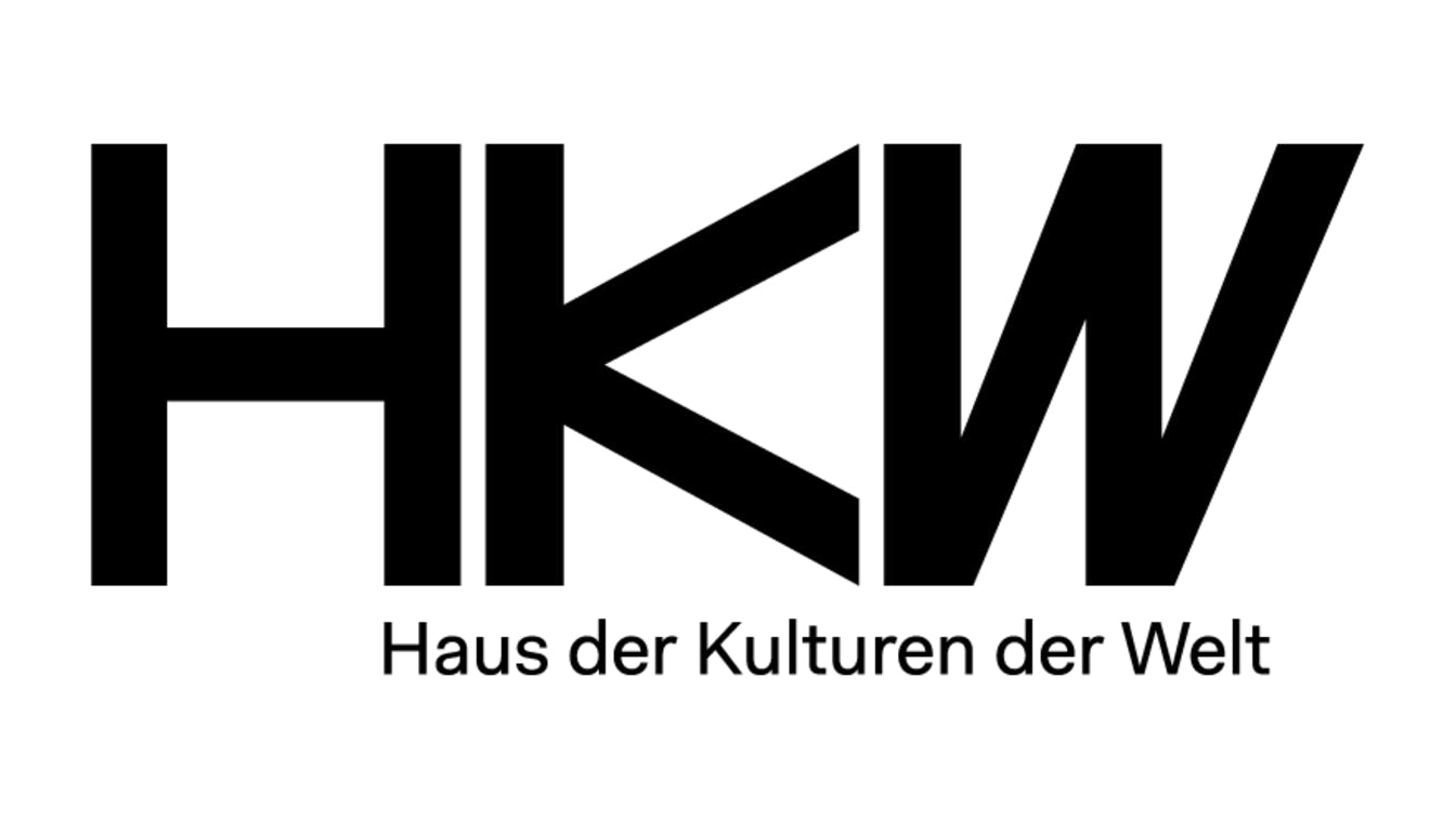
We chose to focus on the acronym HKW in the design of the new logo, and based it on the institution's unique building construction.
Continuing a visual history
An important aspect of the work was to take into account the existing historical and visual framework. All furniture and interiors are designed specifically for the building, and the colours used represent a certain historical era. This created the context for the new visual identity.
Animated identity: Sound and motion: CatK
Teaser for the Anthropozän project: Sound and motion: CatK
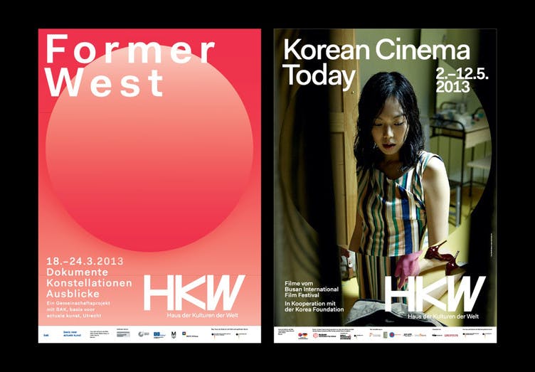
New perspectives
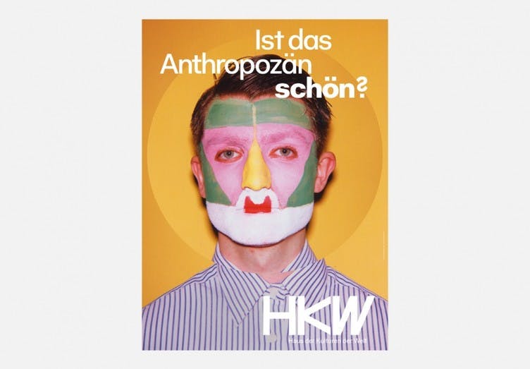
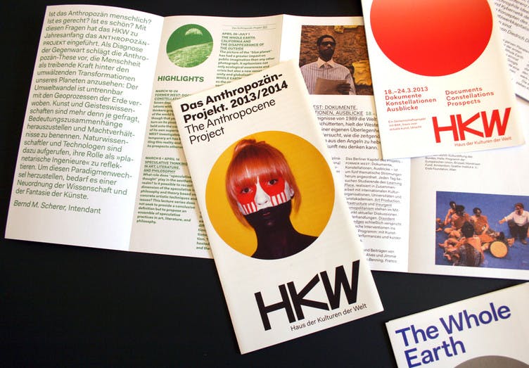
In addition to the visual identity, we also developed a communication concept to reflect the content of the institution. The starting point was to view things from new angles and change the perspective on the world we live in. The concept is rooted in a circle, with a reference to the globe, which is always placed in the centre of the format. The circle is used to highlight, or change, the view of the content behind through magnification, shift of focus, movement, or as a single circular shape.
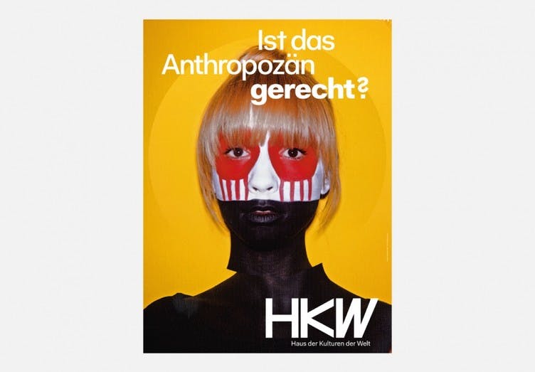
Posters for the Anthropozän project. Foto: Luke Stephenson
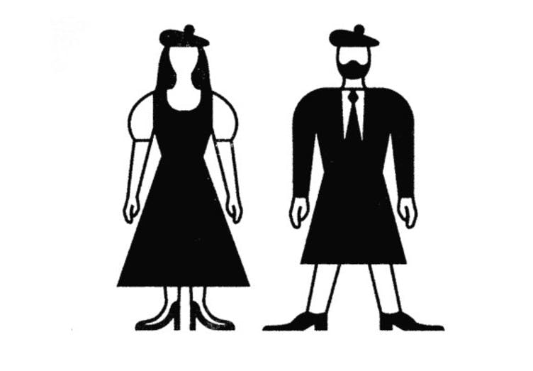
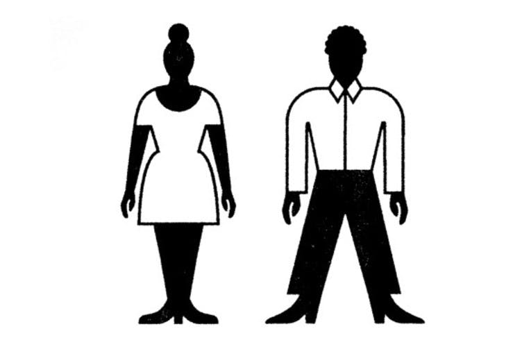
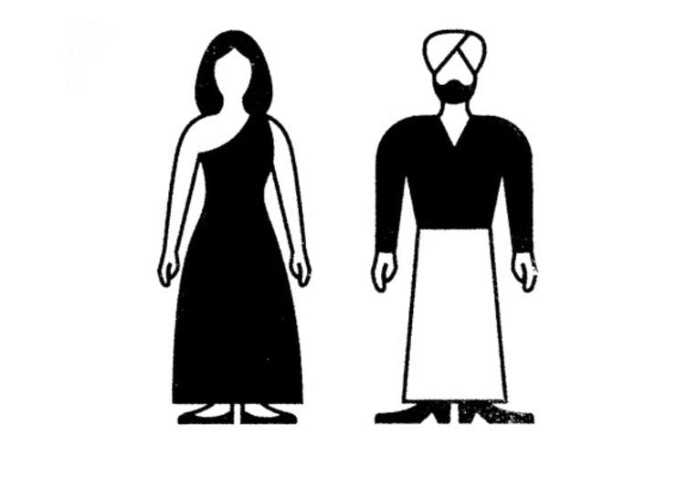
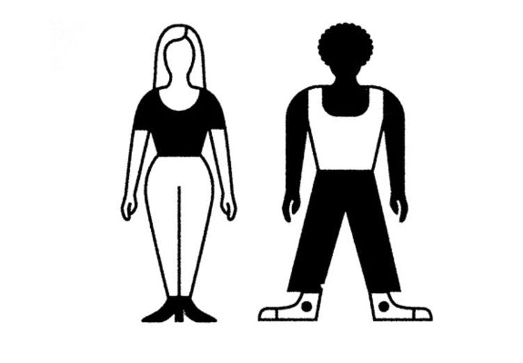
Toilet icons. Illustrasjon: Golden Cosmos