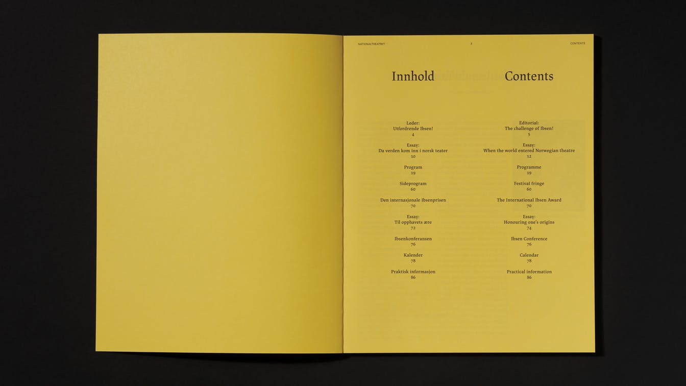
Nationaltheatret Ibsenfestivalen
Maximised visibility with limited means Result: 40% increase in visitors
Strategy | Concept | Art direction | Campaign identity
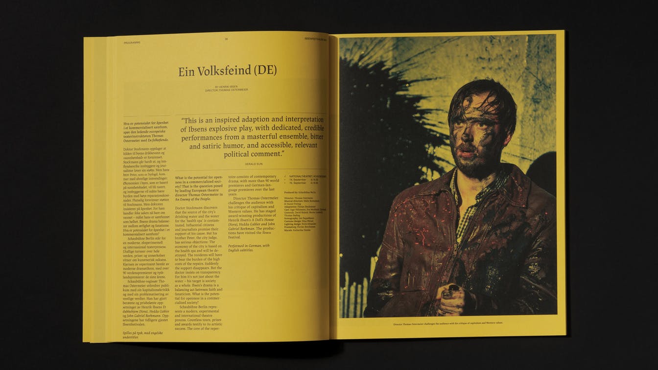
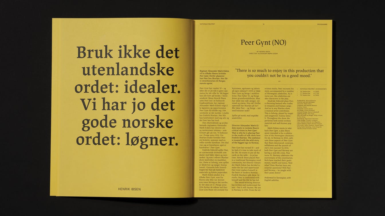
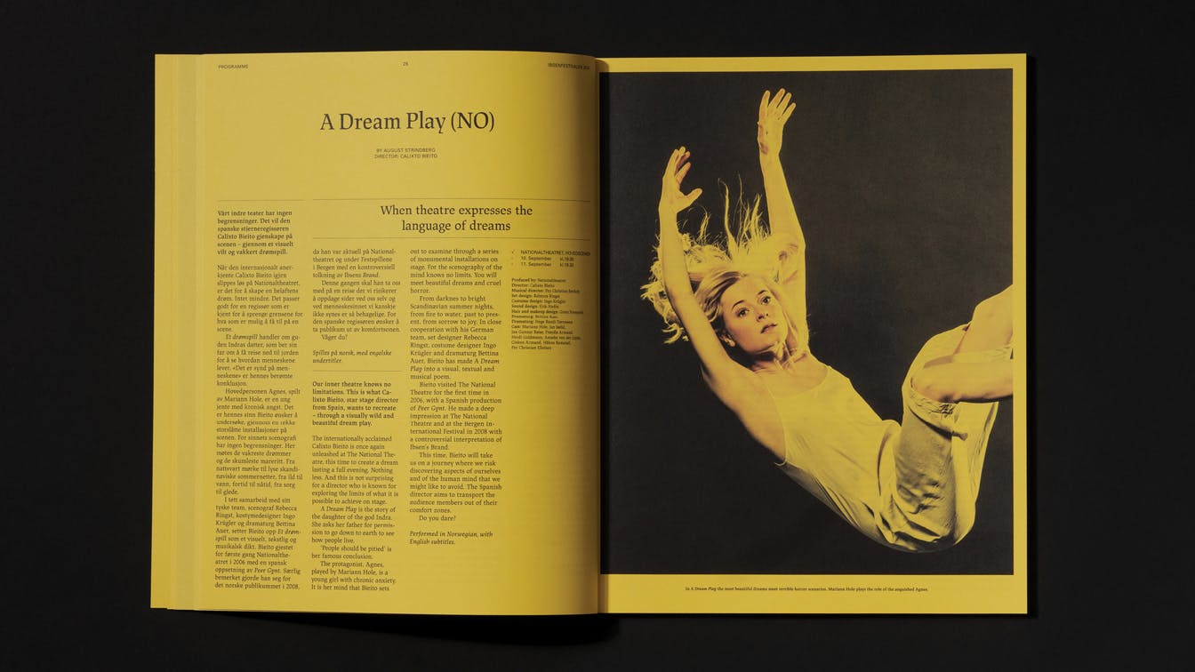
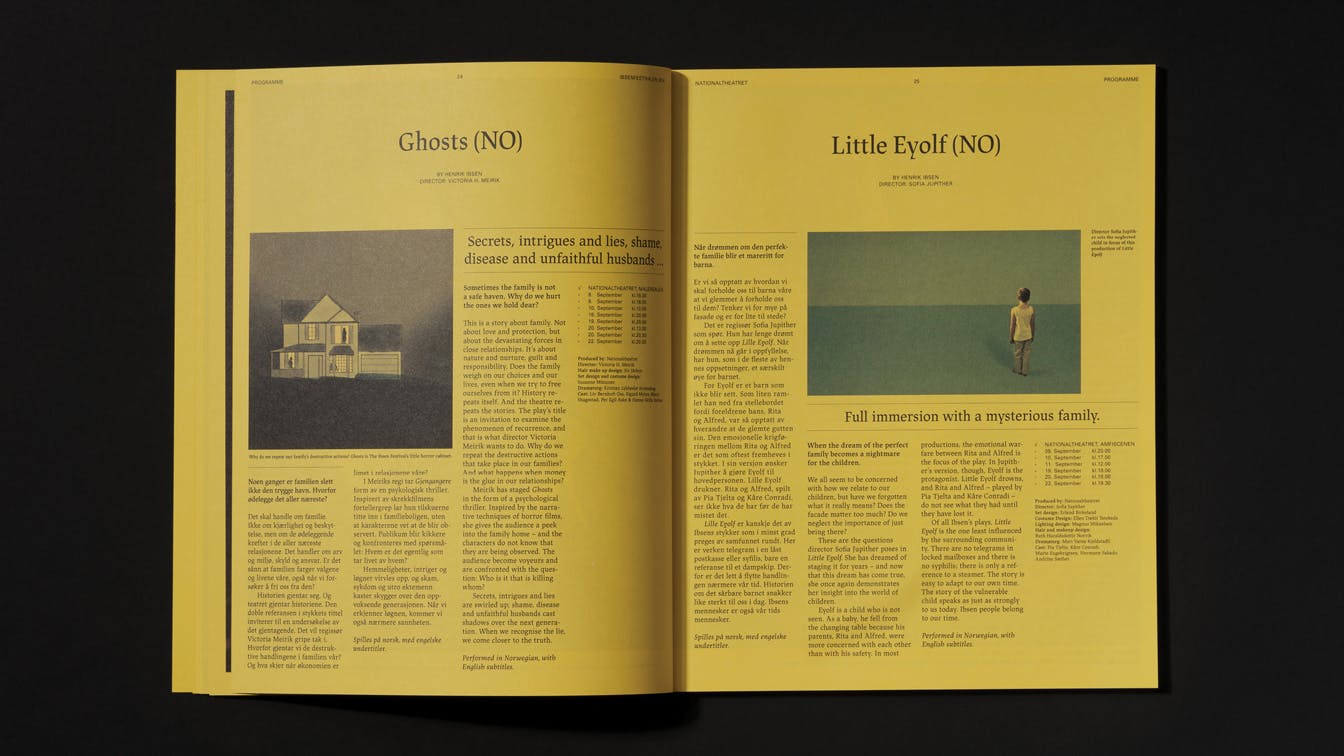
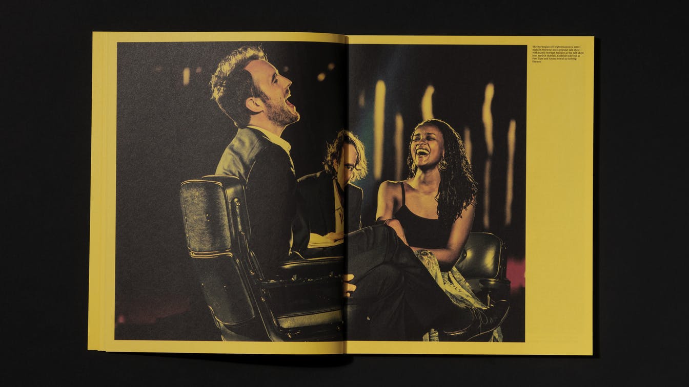
The Ibsen Festival is a tribute to Norway's greatest playwright, Henrik Ibsen, and his pioneering work, which challenged the conventions of his time. The festival's ambition is to highlight Ibsen's relevance today. Throughout the festival period audiences are introduced to new interpretations of his most famous plays.
Working on the visual profile and communication for the festival, we wanted to emphasise the meeting between Ibsen's present and our present.
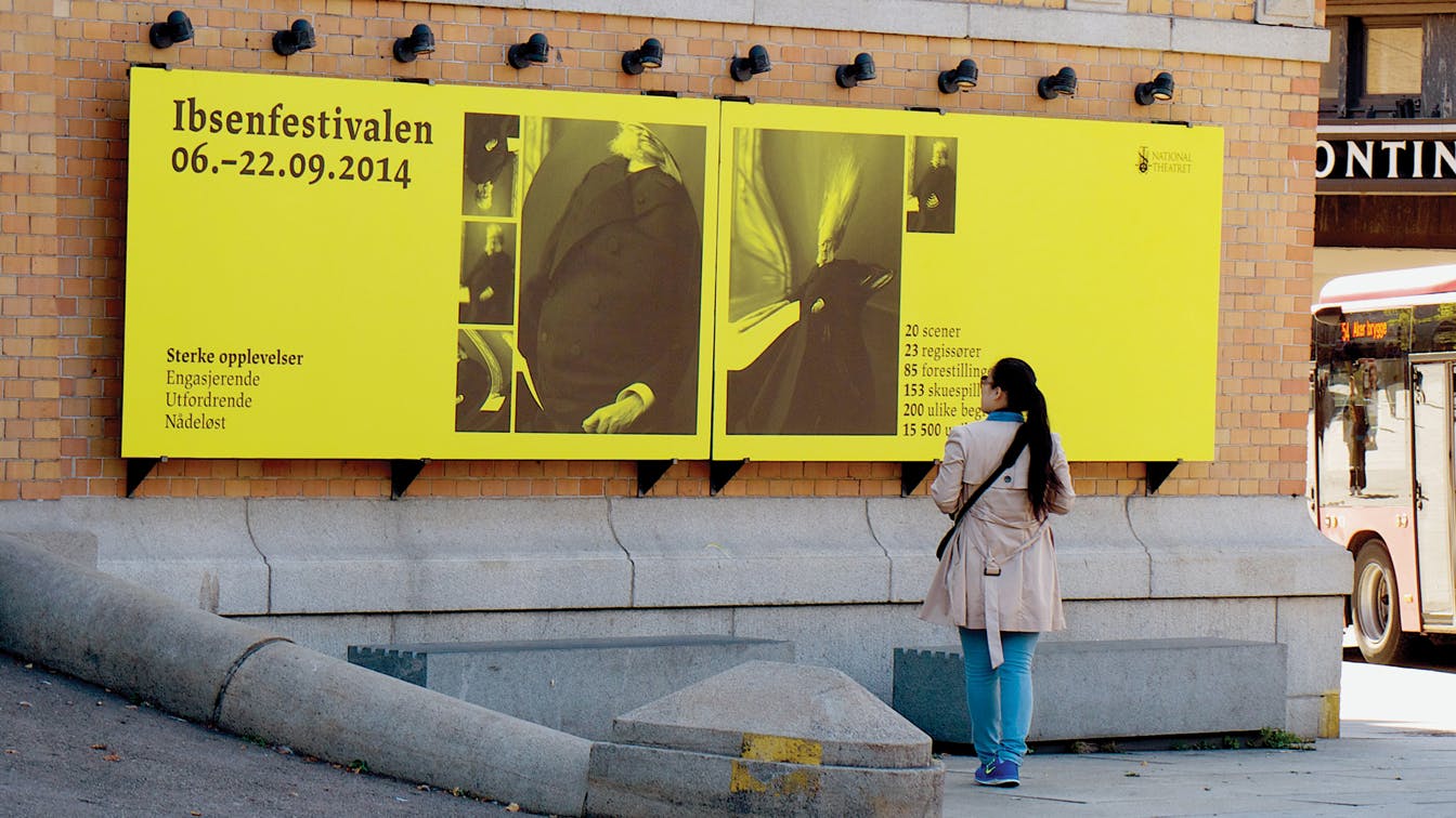
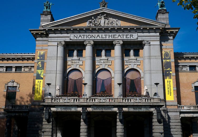
The building as a communication channel: The National Theater, as a central building in tOslo, became an important surface for signaling the Ibsen Festival
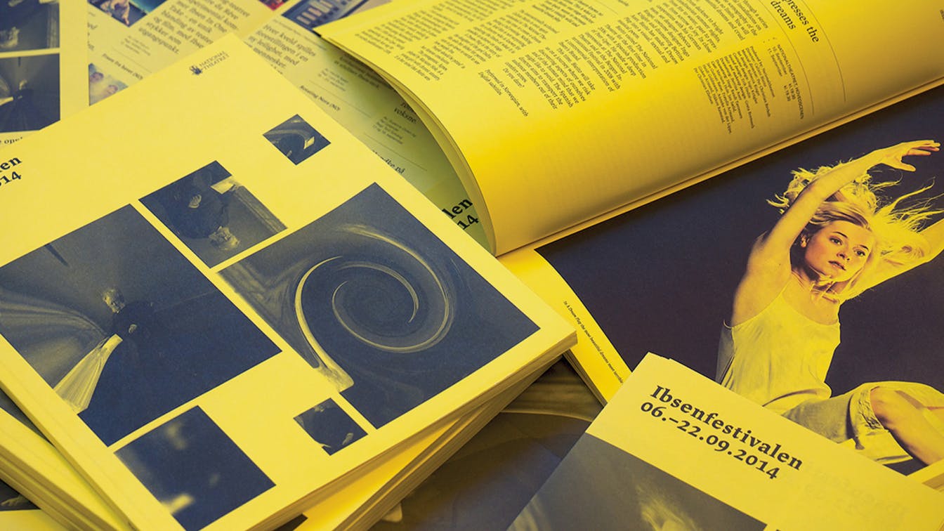
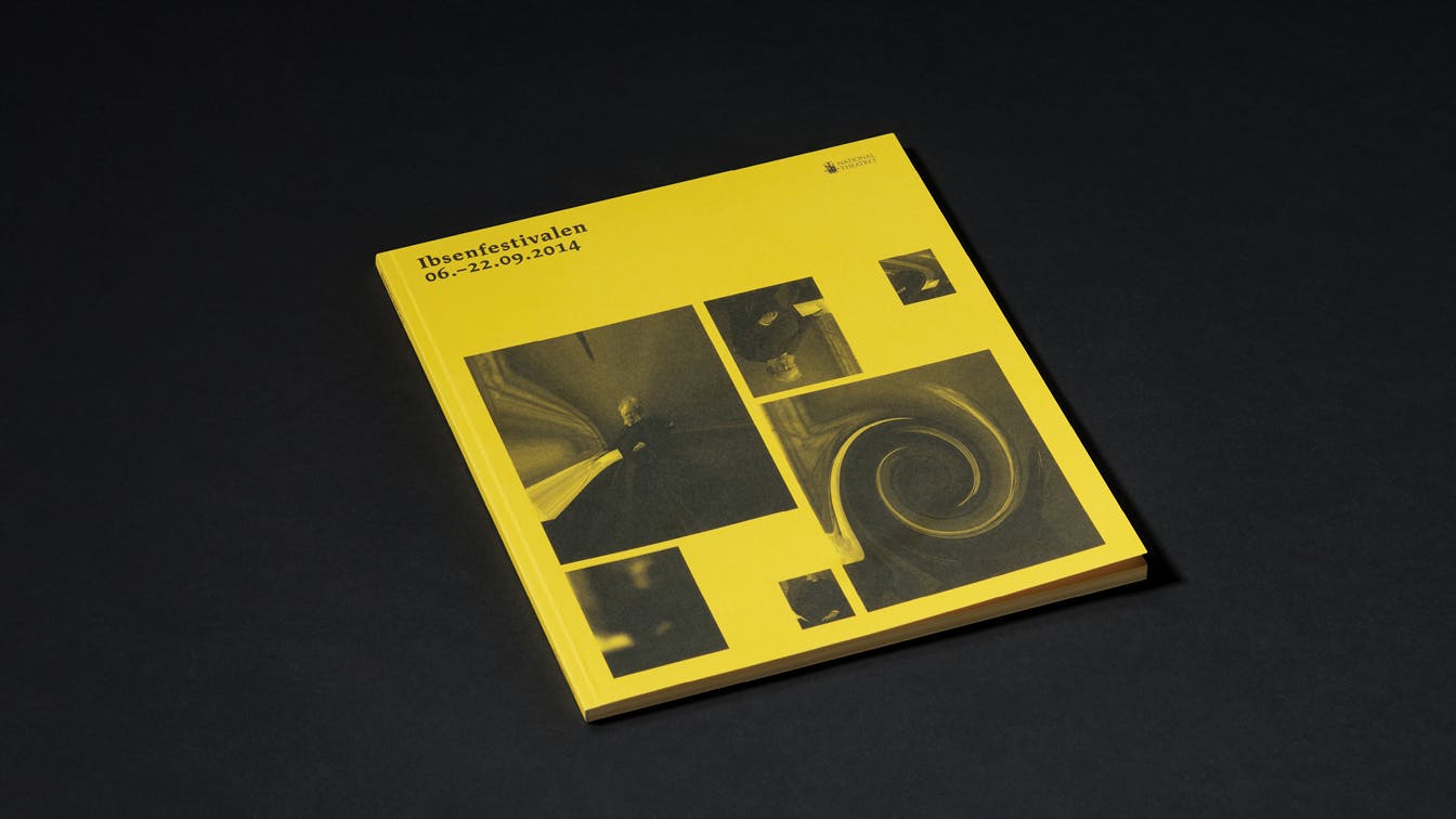
Just one picture
In the communication, just one picture of Ibsen was used. We interpreted the iconic portrait in various ways through well-known Photoshop effects of our time, such as twirl, pinch and wave.
The new interpretations of the image were then placed in the context of selected Ibsen quotes.
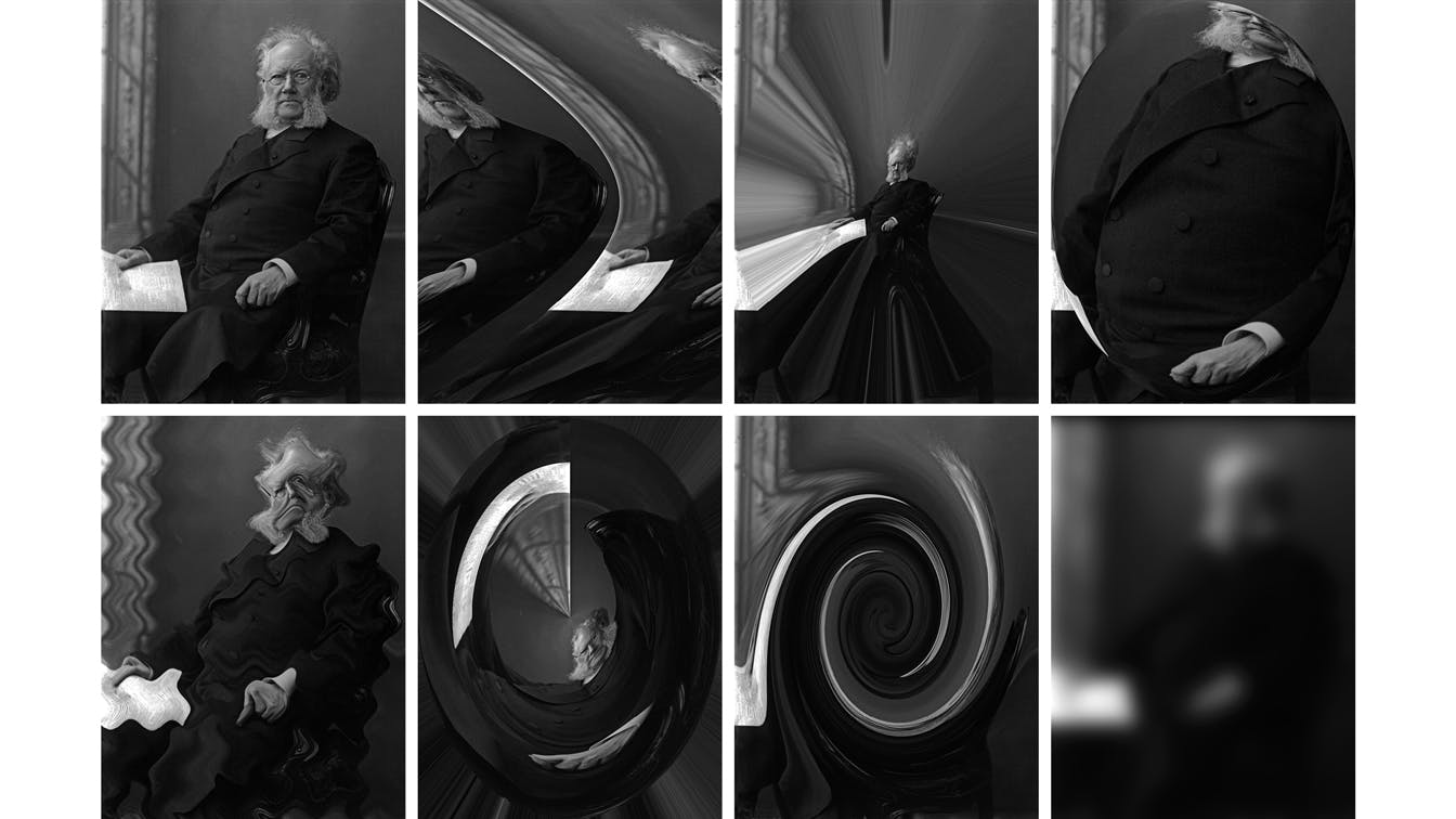
A range of effects: As part of the communication concept, the iconic image of Henrik Ibsen was inflicted by a number of Photoshop effects.
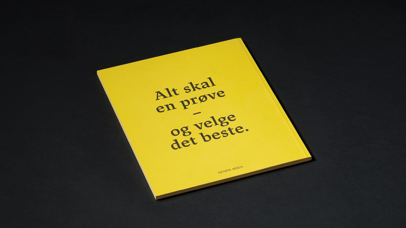
Typographic representation of Ibsen's time
Our chosen typography bears clear references to the time and place of Ibsen’s work, which was a special period for typographic development. For a long time, blackletter – gothic and ornamental typefaces – were the standard for printed texts in large parts of Europe. This was then challenged by the simpler expression of antiquity. One can see the transition between, and in some cases the combination of, blackletter and antiquity in the visual design of Ibsen's published work at the time.
In the profile of The Ibsen Festival, we have used a typeface, JAF Lapture, that combines the two expressions. This gives a distinctive and contemporary feel, but with clear historical references.
Visueltkonkurransen"... it is kind of incredible that one has got a big, and slightly traditional institution, to use liquify and other ‘cheap’ digital effects to distort images of the famous author."
A festival with a limited lifespan needs to draw immediate attention. The combination of simple image manipulation and a strong yellow colour placed in the context of a relatively classic layout, creates a new and unexpected expression from an institution like The National Theatre in Oslo.
The ugly is lifted into a beautiful context, which creates a visual tension, and represents the core of Ibsen's work.
Visueltkonkurransen"A brave and unexpected radical solution both in terms of image usage and colour selection."
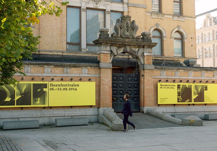
Yellow signal color: A distinct solid colour was used in all of the communication related to the Ibsen festival.
The Ibsen Festival increased the number of visitors by 40% from the previous year.