
TAG Arkitekter Modular architecture
Seeking new possibilities within predefined limitations Exemplified by typography
Strategy | Concept | Visual identity | Art direction | Motion | Sound
TAG Architects have offices in Oslo, Bergen and Trondheim, and are currently counting 70 employees. Since the company was established in 2009, the focus has been to challenge conventions regarding modular architecture as generic and conform.
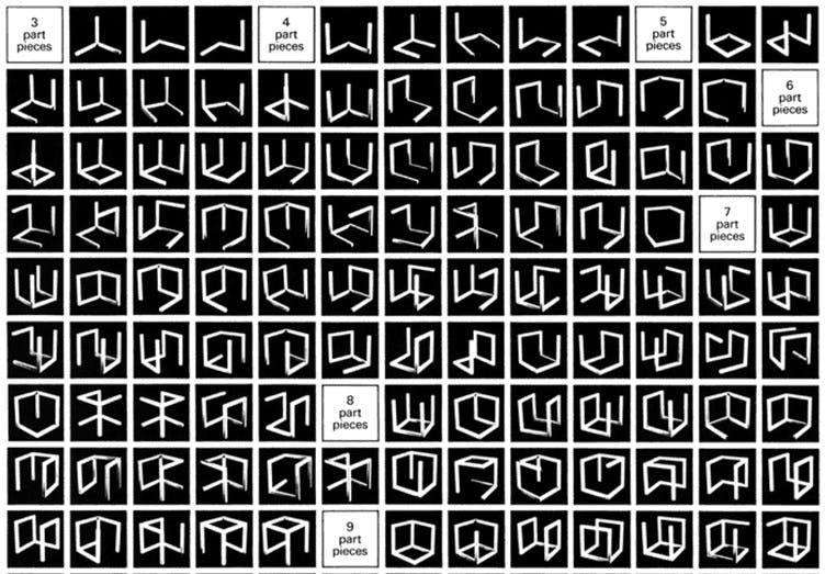
Sol Lewitt: The inspiration in the work on the visual profile of TAG is taken from Sol Lewitt's sculptures "incomplete open cubes". Variation and possibilities with one and the same starting point.
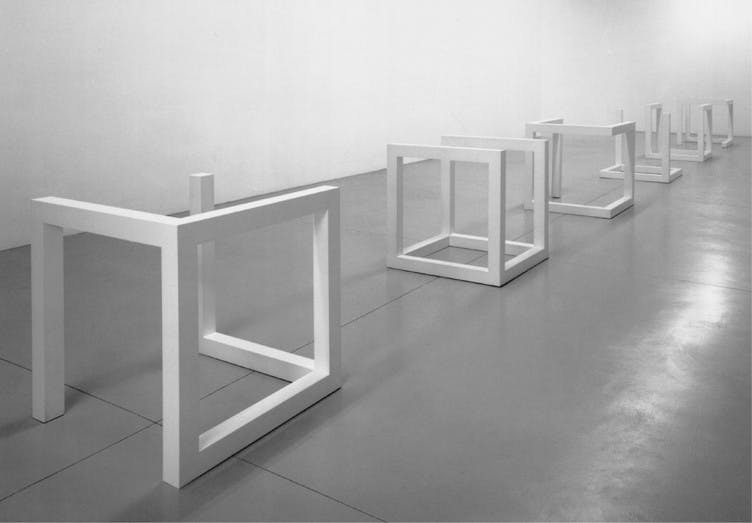
Incomplete open cubes: Physical sculptures by Sol Lewitt.
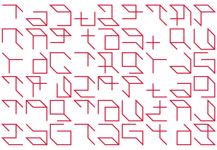
50 variations: In the new typeface, where each letter is based on the construction of a cube, the result was 50 different variations of the name tag TAG.
Visualising a core business
Working with the branding of TAG, the aim has been to translate and underline the idea of being innovative within strict rules and limitations – to visualise and exemplify a creative approach and philosophy within a visual identity.
Animated Identity: In connection with the launch of the new identity, the typeface and concept were visualized through sound and animation. Animation and sound: CatK
Starting off with a cube
Inspired by the sculptures of Sol Lewitt, Incomplete Open Cubes, we decided to develop a font based on the same principles. Based on the structure of a cube, we created 50 variations of the letters TAG, exemplifying the idea of seeking variations within strict limitations.
VisueltkonkurransenThe jury was very inspired by this project, with its genius simplicity and hypnotic expression.The minimalistic lines reveals the logo in many smart ways, while also giving a clear association to architecture. It’s well thought out, with layers of playfulness, elegance and exploration.
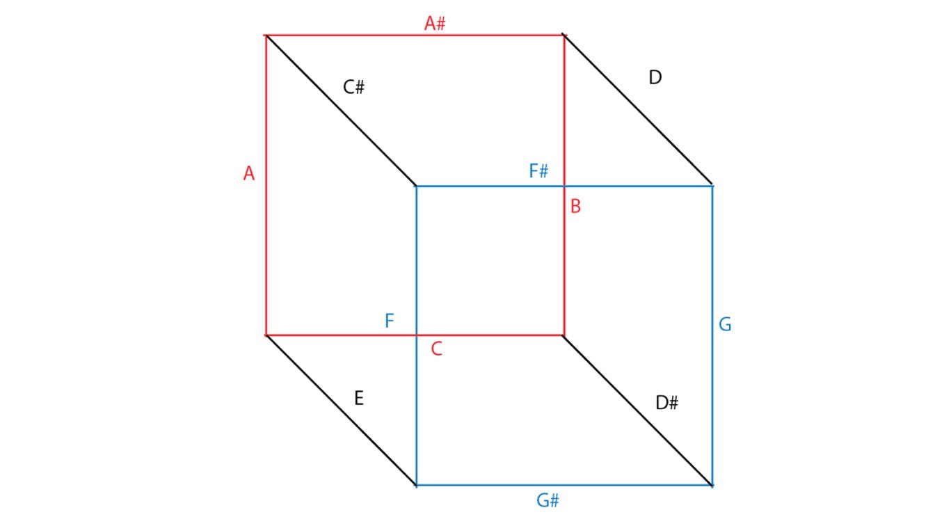
Sound and light installation: In connection with TAG turning 9 years old in September 2018, we created a sound and light installation. Each line in the cube contained a separate sound, and the modular typeface was translated into a musical piece. Sound design: CatK
Physical identity: Two installations were made, one in Oslo and one in Trondheim. Through programmed sequences, the audience got to experience the visual profile of TAG as light and sound. Light installation: Children of the Light and Luke Meints. Sound design: CatK. Film: Johnny Vaet Nordskog, Sindre Kvalsvik and Bødvar Hole.
Constant change
By applying variations of the logo to different channels of communication, the audience is reminded of the fact that a modular approach doesn’t mean a static result.
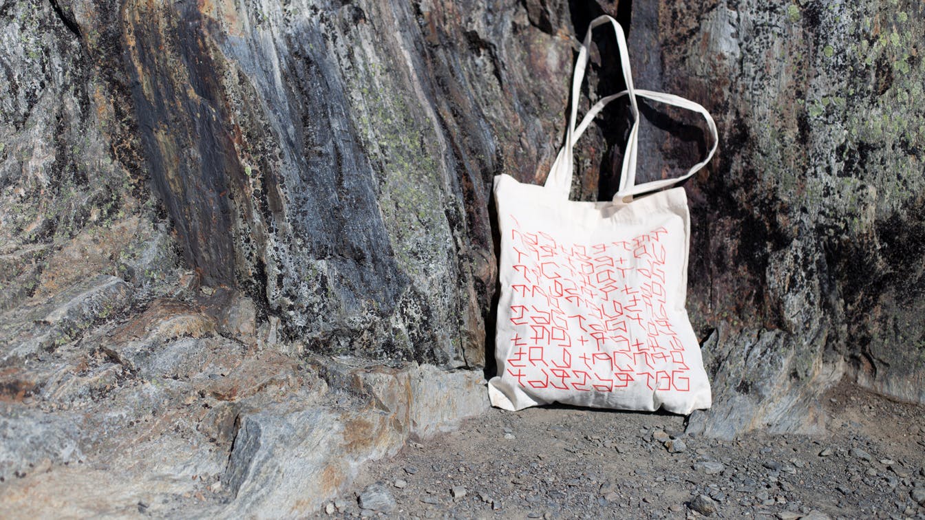
Many outlets: The visual profile is applied and exemplified on a number of different surfaces.