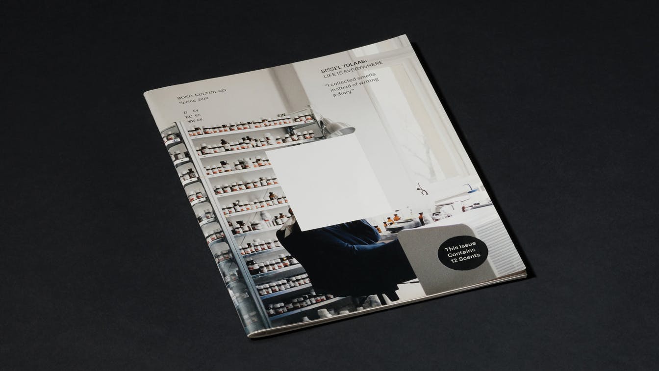
Mono.Kultur Sissel Tolaas
Scratch and sniff Smell as our primary sense
Concept | Art direction | Editorial design
Mono.Kultur is a German magazine, written in English, where each issue looks at only one person. Through an long, in-depth interview, you gain insight beyond what you would normally expect from a portrait interview. This is also reflected in the visual design. Each edition has a tailor-made expression, with a new designer selected specifically for each issue.
We were asked by Mono.Kultur about designing the edition featuring the Norwegian artist and researcher Sissel Tolaas.
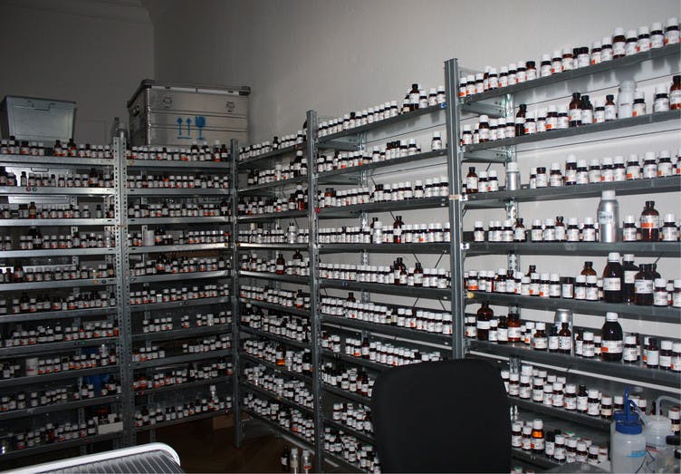
Photo: Kai von Rabenau
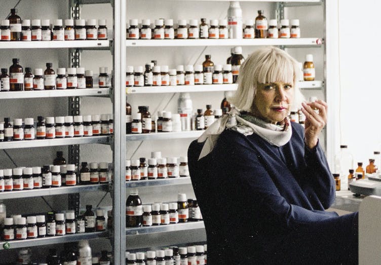
Photo: Kai von Rabenau
Odour – our primary sense
Tolaas has dedicated her life to exploring what she thinks is our forgotten sense, the sense of smell – a sense we do not use or need to the same extent as before, which means that we lack a language describing the experience of smell.
The interview with Tolaas supports the idea of smell as our primary sense. Designing a magazine is usually about supporting the content by visual means, but in this case such a starting point would be a contradiction. The idea of smell as a primary sense would have been undermined by a visual interpretation.
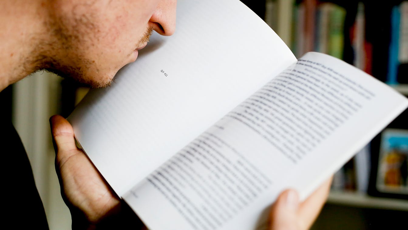
Photo: Monica Strømdahl
The smell of panic
The magazine describes one of Tolaas's projects, where she collected sweat triggered by panic attacks in 10 different people – smells she since reproduced in her laboratory. The smells are impossible to describe by means of words or visual aids, they must be experienced in their natural form.
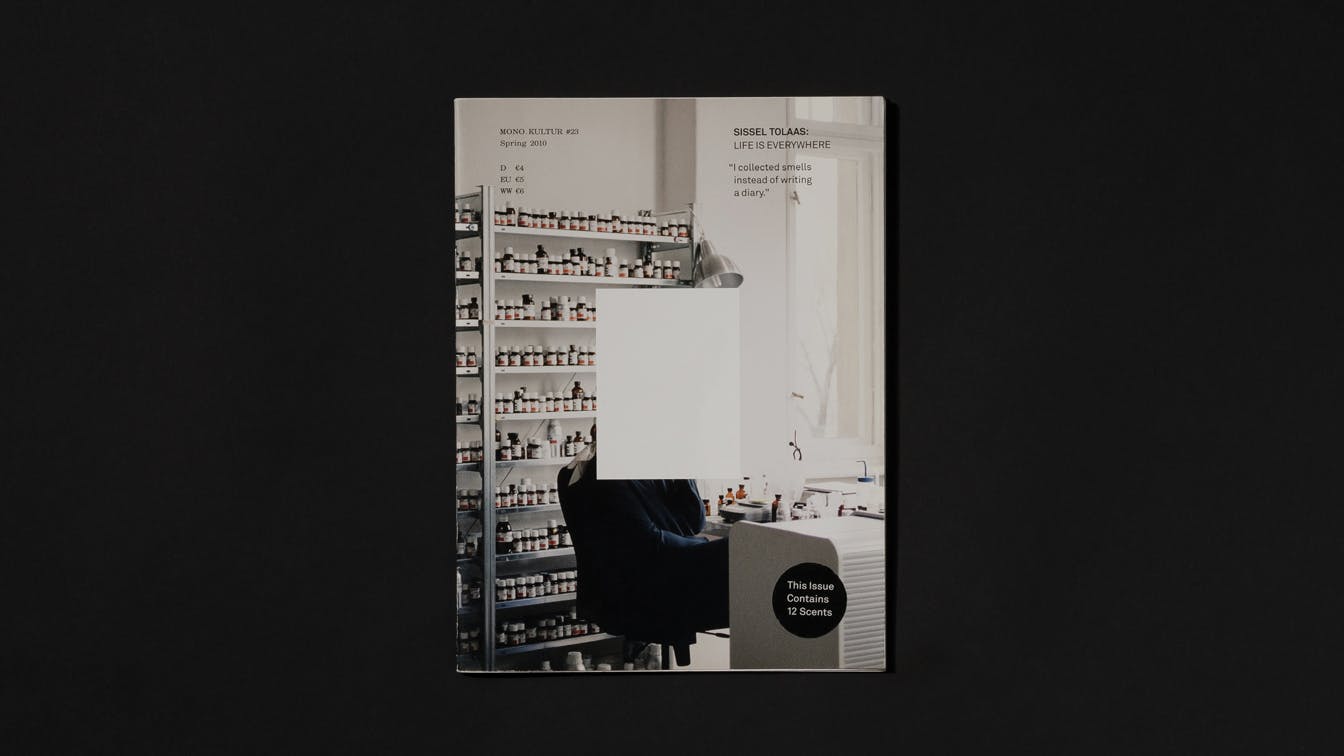
Photo: Einar Aslaksen
Infused with 12 smells
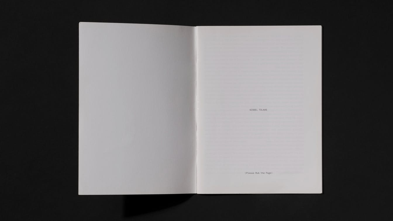
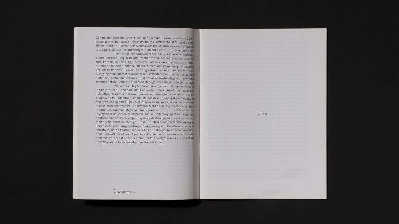
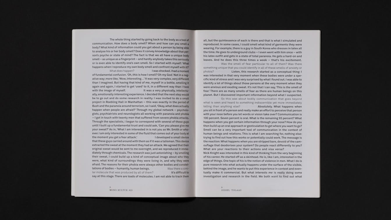
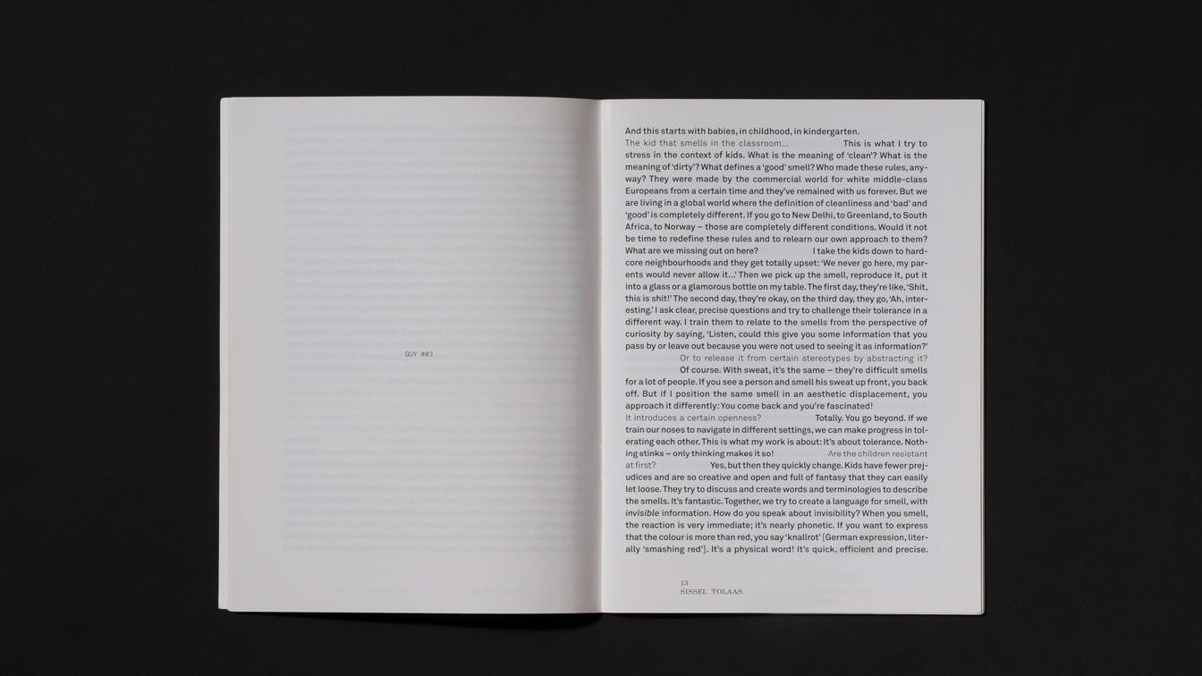
Using the same technique as for scratch and sniff stickers, we transferred the scents from the Tolaas project directly onto the paper of the magazine. 10 pages remained visually empty, but by scratching the surface, the body odour from each person's panic attack was triggered.
On the cover you get an insight into the laboratory where the smells are produced, but the face of Tolaas has been removed from the photograph. We wanted to show the starting point for the project without providing visual representation of the person behind. Her own body odour was produced in the laboratory and transferred directly onto the paper. This way the reader could smell her, but not see her.
Vanity FairThis is one way to argue for the singular importance of print!
Typographic holes
Typographically, the idea of a visual absence is supported by indentation between the questions and the answers in the interview. This leaves white holes throughout the text, which also makes it easier for the reader to navigate.
OlfactoristI have to go and wash my hands right now
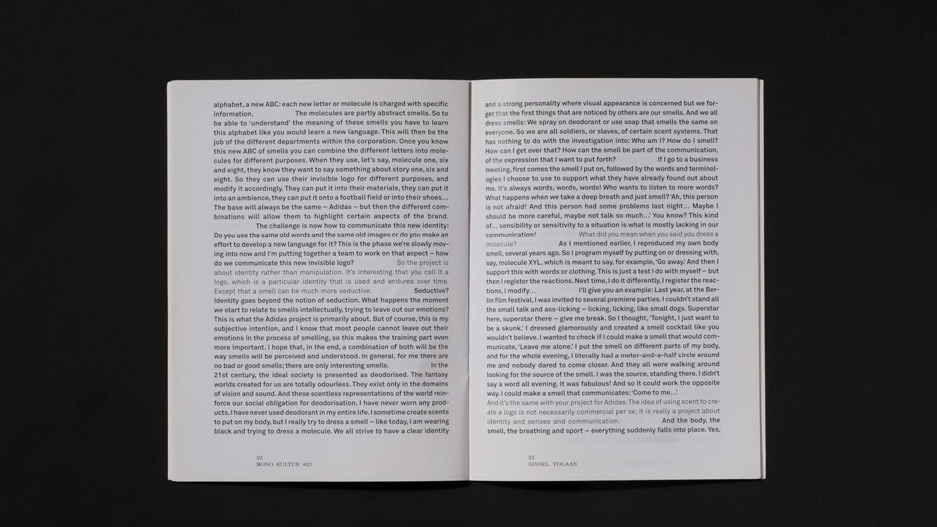
Photo: Einar Aslaksen
Strong reactions
The magazine sparked strong reactions among readers, and the idea received great international attention. The edition was covered by a number of media outlets, and it is also described in the book Graphic Design: Now in Production, published by Walker Art Center.
